All three of my main media products use, develop, and challenge the forms and conventions of their real-world counterparts in various different ways. The main product is our group's "Sweet Dream" music video, the second is our digipak album cover, and the third is the website for our artist "The Acrylics."
This Prezi will take you through the answer to this question with regards to my music video. You can control it using the embedded control icons or your arrow keys and/or mouse, or click the icon in the bottom-right corner for a larger view. No matter how or where you view the Prezi, the controls should be the same.
Hopefully that presentation told you everything you wanted to know about using, developing, and challenging forms and conventions in my music video.
For the website, I will answer the question using this Padlet. It allows me to put images in a long column to mimic the layout of the website (each of these images can be enlarged for better viewing) while making branches off of these images to describe how my website uses, develops, and challenges forms and conventions. You can use the scroll bars as well as your mouse to move around and interact, or alternatively scroll past the Padlet and click the icon to open the Padlet in another window if you would prefer to view it that way (if you open the Padlet in another tab, the images within the Padlet should open larger when you click them also.)
Click the below image to open the above Padlet in a new window, for a more fullscreen experience with less use of the scroll bars, particularly the horizontal one, and the ability to see the full resolution of images once you click on them within the Padlet.
However you chose to view it, hopefully the Padlet will have answered this post's main question for you in regards to my website.
The final webtool of this post is an answer to the question in regards to my digipak. It is a Google Slides presentation, which is more visually appealing than a regular presentation, and which integrates directly into this post. You can use the icons or the arrow keys to scroll through the presentation at your leisure, even pausing the presentation if you dislike the autoscroll feature, and you can open it in fullscreen for optimal viewing using the hollow square icon second from the right.
Hopefully this webtool will have enlightened you on how my digipak uses, develops, and challenges the conventions of real-world album covers.
Now that you are at the end of the post, you should have an understanding of how my music video, website, and digipak all use, develop, and challenge the forms and conventions of real media products. You can go back and visit any of the webtools at any time.
My front digipak panel:

Right-click the image and open it in a new tab for a bigger version.
My inside digipak panels:
Right-click the image and open it in a new tab for a bigger version.
My back digipak panel (with album spine:)
Right-click the image and open it in a new tab for a bigger version.
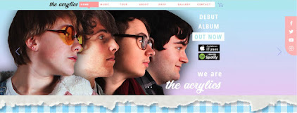
Click the image below to open my website in a new tab:
Friday 5 January 2018
Evaluation Question 2: How effective is the combination of your main product and ancillary texts?
To create a successful campaign, all the media products must combine effectively and all work together.
This webtool will go over how my main product, the music video, and one of my two ancillary products, here the digipak, work together effectively. It is a Mindomo mindmap. You can scroll around using the mouse and zoom using the bottom right icons, or click the bottom left icon to fullscreen it in a new tab.
Hopefully this has explained all the ways my music video and digipak work together, and how effective this is.
This next webtool is a Slides presentation. It will describe how my music video and the other main ancillary product, the website, combine effectively. Please click the fullscreen icon in the bottom right for optimal viewing, and please note should you need a larger view of any image you can right-click it and open it in a new tab where you can then even magnify it further, although you will have to exit the fullscreen mode of the presentation.
That webtool should have explained how effective all the ways these media products have combined are.
Overall I think all my media products works really well together and create an effective campaign.
Evaluation Question 3: What have you learned from your audience feedback?
We consulted our target audience throughout the project and for each of our products to ensure we were doing the right thing to achieve our goals of providing an enjoyable artist and media products to this same audience. We sought, gained, and used audience feedback in various different ways and for various different reasons.
A short summary profile of our target audience would be as follows: a young British person, from their young teens to early-to-mid twenties, most likely but not exclusively female, who enjoys the Indie Pop genre and embraces all the conventions, quirks, and lifestyle influences that come from this, to do with the music and media products themselves, but also to do with the stylish hipster fashion and upbeat aesthetic across it all.
This first webtool chronicles audience feedback for the music video, which is also (by virtue of the music video being the main product) the journey of audience feedback in relation to our artist overall somewhat. It is a Prezi which you can go through at your leisure and experience each section. Please click the fullscreen icon in the bottom right corner to view it, and then you can use your arrow keys or one of the onscreen options to move through it. You can also play and pause the audio and video files.
Hopefully that told you everything you wanted to know about our relationship with audience feedback throughout this aspect of the project.
This next webtool is a Padlet about audience feedback in relation to our digipak. It covers each stage of the project and the approach we took, as well as what we learned from each. You can either scroll inside the box below, or scroll past it inside this blog post and click the below image, which will open the Padlet fullscreen in a new tab for optimal viewing.
Here is the image you can click to take you to the fullscreen Padlet. You can click any image to enlarge it, and use the play and pause functions on the audio and video.
Hopefully that webtool will have explained the collection, use, and findings of audience feedback in relation to the album cover throughout this project.
This final webtool is a Mindomo mindmap serving the same function as the previous two webtools but for the website instead of the music video or digipak. Scrolling is done with the mouse and zooming using the bottom right icons; click the bottom left icon to fullscreen it in a new tab for optimal viewing.
The webtool should have explained everything relevant about audience feedback in relation to this part of the project.
Overall I think audience feedback has been important for our project, having an impact on each product at each major stage, and it has all turned out the better for it.
A short summary profile of our target audience would be as follows: a young British person, from their young teens to early-to-mid twenties, most likely but not exclusively female, who enjoys the Indie Pop genre and embraces all the conventions, quirks, and lifestyle influences that come from this, to do with the music and media products themselves, but also to do with the stylish hipster fashion and upbeat aesthetic across it all.
This first webtool chronicles audience feedback for the music video, which is also (by virtue of the music video being the main product) the journey of audience feedback in relation to our artist overall somewhat. It is a Prezi which you can go through at your leisure and experience each section. Please click the fullscreen icon in the bottom right corner to view it, and then you can use your arrow keys or one of the onscreen options to move through it. You can also play and pause the audio and video files.
Hopefully that told you everything you wanted to know about our relationship with audience feedback throughout this aspect of the project.
This next webtool is a Padlet about audience feedback in relation to our digipak. It covers each stage of the project and the approach we took, as well as what we learned from each. You can either scroll inside the box below, or scroll past it inside this blog post and click the below image, which will open the Padlet fullscreen in a new tab for optimal viewing.
Hopefully that webtool will have explained the collection, use, and findings of audience feedback in relation to the album cover throughout this project.
This final webtool is a Mindomo mindmap serving the same function as the previous two webtools but for the website instead of the music video or digipak. Scrolling is done with the mouse and zooming using the bottom right icons; click the bottom left icon to fullscreen it in a new tab for optimal viewing.
The webtool should have explained everything relevant about audience feedback in relation to this part of the project.
Overall I think audience feedback has been important for our project, having an impact on each product at each major stage, and it has all turned out the better for it.
Evaluation Question 4: How did you use new media technologies in the construction, research, planning, and evaluation stages?
Our group was lucky enough to be doing this project in the modern age. This allowed us access to a wealth of media technologies, with only the good older technology surviving and the bad things having been cut out by now, and with a plethora of new technology to choose from. This applied to every stage of our project, and practically everything we chose to use was incredibly useful in its own way.
The webtool should hopefully have been enough to describe the depth and breadth of the kinds of new media technology we used in the construction phase.
For the research stage, we used quite a few different technologies. Some of these were quite basic pieces of technology that are considered basic and essential for a reason, and others were more specific and purpose-made for exactly what we needed them for. This Google Slides presentation will take you through some of these. You can fullscreen it for optimal viewing with the 'empty square' icon, and move through it with your arrow keys or the integrated arrow icons.
That webtool should have explained to you how we have used various different platforms and technologies to our advantage while doing research for this project.
The following Prezi explains some of the new media technologies we used in this very set of evaluation posts. We re-evaluated the use of previously used technologies as well as embracing entirely new ones (relative to this project.) Click the fullscreen icon in the bottom right for optimal viewing, and then use the arrow keys or onscreen arrow icons to navigate, or your mouse if you would like.
That should have explained the diversity of new media technologies in the evaluation stage, as well as the diversity of how we used them.
Overall, various new media technologies helped us throughout the entire project. Sometimes the old technologies proved why they were still around, but having access to the fruits of the modern age still really helped us every step of the way due to ease of use, accessibility and flexibility, and so on.
The following Slides webtool will take you through some examples of the new, modern media technologies which we used throughout the construction phase, as well as how and why they were so good. Click the bottom right icon for optimal fullscreen viewing, and use the provided arrows or your arrow keys to navigate.
The webtool should hopefully have been enough to describe the depth and breadth of the kinds of new media technology we used in the construction phase.
For the research stage, we used quite a few different technologies. Some of these were quite basic pieces of technology that are considered basic and essential for a reason, and others were more specific and purpose-made for exactly what we needed them for. This Google Slides presentation will take you through some of these. You can fullscreen it for optimal viewing with the 'empty square' icon, and move through it with your arrow keys or the integrated arrow icons.
That webtool should have explained to you how we have used various different platforms and technologies to our advantage while doing research for this project.
This webtool will walk you through what we used in the planning stage. We took advantage of both old and new technologies in this stage, sometimes combining them for the greatest effect and efficiency. All of this is explained in the Padlet, which can either be scrolled through in this box, or you can move past it in this blogpost and click the image below, which opens it fullscreen in a new window for optimal viewing.
Here is the image to open the Padlet in a new tab, which is recommended for the best viewing.
That should have explained most of the ways we used new media technologies during the planning stage.
The following Prezi explains some of the new media technologies we used in this very set of evaluation posts. We re-evaluated the use of previously used technologies as well as embracing entirely new ones (relative to this project.) Click the fullscreen icon in the bottom right for optimal viewing, and then use the arrow keys or onscreen arrow icons to navigate, or your mouse if you would like.
That should have explained the diversity of new media technologies in the evaluation stage, as well as the diversity of how we used them.
Overall, various new media technologies helped us throughout the entire project. Sometimes the old technologies proved why they were still around, but having access to the fruits of the modern age still really helped us every step of the way due to ease of use, accessibility and flexibility, and so on.
Friday 22 December 2017
Construction Post 6: Editing the website
The third and final product of the construction phase would be the website. Jack was leading this project- as with the other stages, the leader did the majority of the basic work with lots of input from the other two group members, who also helped out. In this case me and Noa were the helpers, and we helped not only by doing some website editing, but also by creating various elements for the website, especially in the final week when we had both mostly finished off our products and Jack needed an extra boost from us. The website was built using Wix, an online website creation software with the ability to edit your website and then publish it live, with Photoshop used to create various images to be used to actually build the site within the browser. Website editing consisted of creating various pages and website elements, and linking them all together. We have a pop-up, a home-page, and a few supplementary pages that can be accessed from the relevant sections of the main page- for example, clicking the competition image takes the viewer to the special competition page. The home page is built of lots of small sections, including one for the debut video, one for the album, one for the gallery, one for the merchandise shop, and so on.
Our Challenges
A few problems came up during this stage. The main one was the sheer number of images needed on top of the actual framework of the website- the video, for example, had all the footage already available, and the digipak required image editing but also had the basic template already in place. Thus we had to manage time well to have enough for all three projects, with Jack trying to stay ahead to save us time (which he did well) and Noa and I trying to not neglect our own products while aiding Jack (which we managed to do.) Breaking up the work over the multiple weeks we had, and Jack assigning us things to make for him so he could focus on other stuff and know he would have access to another image later on without having to work on it himself or worry, both really helped us overcome this challenge and get all three products done in time.
Another thing we had to contend with was the way Wix works. Sometimes, we had a plan for something, often something quite conventional, but Wix didn't have a one-step tool for it. For example, if we wanted an image to change when the mouse cursor touched it, yet still be a link to somewhere else, we couldn't just use the button tool- we had to make an invisible link box over an image box. Wix is a great website and piece of software, but it came with a learning curve, especially since we hadn't used it in any other projects throughout the years, although we overcame each issue as they came and still managed to have everything the way we originally envisioned it, and we were all quite proficient by the end.
My Contributions
My contributions included making four or five of the merchandise images, making some of the general website pictures, coming up with the idea for a coloured outline to appear around each band member when selected with the cursor, suggesting we move each section of the home page apart more to aid in reading them as separate things, finalising the details of the contest, general work and aiding in decisions and design, and more.
Feedback and Changes
We changed the website quite a lot as we progressed, basing the changes on our own adaptations as well as audience feedback, as with the other products. One thing we changed was the obviousness of the contest- an audience member mentioned they wanted to know about it soon after reaching the website instead of having to work more to find it, so we added a link to the contest page to the image gallery at the top of the main page. This solved the problem straight away and ensures people will be more likely to get drawn in quicker.
Another thing we changed was the start screen. We hadn't decided if we were going to have a start screen or a pop-up when we made a flat-plan, as we considered them interchangeable. However, both our target audience and our teachers seemed to agree that a pop-up that doesn't require a change of page is a much better option. Thus, after finding out about this, we added the pop-up.
A third change would be the separation of the 'about' and 'gallery' sections. We originally had them be the same thing- clicking the information box about a band member would open their gallery. However, we found some of our audience who we had try out the website missed this too easily, and thus we added a dedicated gallery lower down the page, with a link to it on the navbar, but still left in the links in the 'about' section. Thus, people who want to click the information boxes to see more are accommodated, but people who don't realise that is an option but still want to see images have a clearly signposted gallery to visit.
Our Progress
Overall I think the website was a success. While it ended up taking us the longest out of all three, and we could probably have learned a bit more of Wix on the weekends before the product construction weeks, we still managed to produce a website very much in line with our original ideas, that looks good and is very functional. We used Wix to its fullest extent and produced something we are all proud of.
 |
| Wix is an all-in-one website creation tool, accessed through their website and used inside the browser rather than being downloaded and launched from the system files like the other programs we used throughout this project. This was a change for us, but one we quickly adapted to, especially because of the many benefits of being online- you could see what your website was going to look like because you were already viewing it in a browser, for example, and you could publish it at any time. Click to enlarge. |
 |
| Photoshop CS5 had been a very important tool to us throughout this entire project. It was the only software used for the digipak, went beyond its standard uses of image editing to aid in video editing and animation for the music viceo, and for the website it helped us create virtually every element of all the pages. Click to enlarge. |
Our Challenges
A few problems came up during this stage. The main one was the sheer number of images needed on top of the actual framework of the website- the video, for example, had all the footage already available, and the digipak required image editing but also had the basic template already in place. Thus we had to manage time well to have enough for all three projects, with Jack trying to stay ahead to save us time (which he did well) and Noa and I trying to not neglect our own products while aiding Jack (which we managed to do.) Breaking up the work over the multiple weeks we had, and Jack assigning us things to make for him so he could focus on other stuff and know he would have access to another image later on without having to work on it himself or worry, both really helped us overcome this challenge and get all three products done in time.
Another thing we had to contend with was the way Wix works. Sometimes, we had a plan for something, often something quite conventional, but Wix didn't have a one-step tool for it. For example, if we wanted an image to change when the mouse cursor touched it, yet still be a link to somewhere else, we couldn't just use the button tool- we had to make an invisible link box over an image box. Wix is a great website and piece of software, but it came with a learning curve, especially since we hadn't used it in any other projects throughout the years, although we overcame each issue as they came and still managed to have everything the way we originally envisioned it, and we were all quite proficient by the end.
My Contributions
My contributions included making four or five of the merchandise images, making some of the general website pictures, coming up with the idea for a coloured outline to appear around each band member when selected with the cursor, suggesting we move each section of the home page apart more to aid in reading them as separate things, finalising the details of the contest, general work and aiding in decisions and design, and more.
 |
| The 'gallery' section of the website. I have scrolled over the image of myself with the mouse cursor (which has disappeared for the screenshot,) revealing the yellow outline and my character's name. The others have not been scrolled over, and thus are just normal images, but they each have their own unique coloured outline and name if selected in the same manner. Click to enlarge. |
 |
| An example of merchandise I created for the online shop. I created each of these separately and saved them as different files, but also made this images with both of them to act as a promo thumbnail image- people will see this in the shop, understand they can purchase an 'Acrylics' branded oyster card holder in multiple colours, and then click the listing and view the individual holder colours through the listing's gallery. Click to enlarge. |
Feedback and Changes
We changed the website quite a lot as we progressed, basing the changes on our own adaptations as well as audience feedback, as with the other products. One thing we changed was the obviousness of the contest- an audience member mentioned they wanted to know about it soon after reaching the website instead of having to work more to find it, so we added a link to the contest page to the image gallery at the top of the main page. This solved the problem straight away and ensures people will be more likely to get drawn in quicker.
Another thing we changed was the start screen. We hadn't decided if we were going to have a start screen or a pop-up when we made a flat-plan, as we considered them interchangeable. However, both our target audience and our teachers seemed to agree that a pop-up that doesn't require a change of page is a much better option. Thus, after finding out about this, we added the pop-up.
 |
| Our website's pop-up. You can see the 'X' to close it in the corner, and through the semi-transparent background you can see the main homepage- clicking the 'X' simply closes the overlay, and leaves you on this homepage, with no need to redirect to a new webpage. Click to enlarge. |
Our Progress
Overall I think the website was a success. While it ended up taking us the longest out of all three, and we could probably have learned a bit more of Wix on the weekends before the product construction weeks, we still managed to produce a website very much in line with our original ideas, that looks good and is very functional. We used Wix to its fullest extent and produced something we are all proud of.
Construction Post 5: Editing the digipak
The digipak was the second product we needed to create for the project- it is essentially all four sides of our album cover, the two outside and two inside, in one Photoshop document within a special template. Noa lead this project, although me and Jack were constantly giving feedback and suggesting ideas and changes, while helping to make important decisions- we also took over from Noa a few times, and did small but significant amounts of work on top of the majority she did, which were key to its completion by the deadline.
The main tool used for editing the digipak was Photoshop- the template we worked off of was a Photoshop file, and we simply saved a copy of it with our changes as we progressed. We used a few different techniques to create the digipak- we chose studio shots of each of us for the front cover, and opened them in their own documents. Then we trimmed out the background, and used Photoshop's various edge options to smooth out any mistakes. Then we graded each person and put them in. We created various other elements for the digipak, such as ripped paper for the front, a colourful swirling background, and even a whole new set of photos from an extra photoshoot we planned and carried out over a few days to get the inside cover images. We chose various fonts to match the style we wanted, and carried over some of these (along with certain colours and other design choices) to the website. We used Photoshop's layering and masking tools to keep each page of the album cover within its assigned box on the template.
Our Challenges
We came across a fair few challenges while putting together our digipak. One big challenge was the technical difficulties we came across- for some reason, Noa's computer started acting up midway through the process. We tried many different things to get it to stop slowing down, and start responding to key presses and requests to open files, even enlisting the help of the media technician and school IT department. However, we eventually decided to save time and just have Jack and Noa swap computers. As Jack was working inside a browser, he had a lot less problems with the computer, while Noa got to move to a computer without any issues. This was an efficient and effective way of nullifying what could have been a very drawn-out and destructive problem.
Another challenge we faced was how to include the title of the album in a way that didn't obstruct the focal image of the album cover, i.e. the band members, but still made the title very visible. We had planned to put it in the corner above the band members on our flat plan, but actually creating the album and seeing how it worked in real life made us realise we didn't have enough space. Thus, we decided on having the effect of a line of ripped paper at the top, with a smaller one below, and the band members in between. The top line of ripper paper provided a blank space for the title to be centralised and obvious, and the space between the paper retained focus on the band members contained within it. Plus, the paper adds to our DIY aesthetic. We thus adapted to the challenges and changing ideas that arose when we created the digipak.
My Contributions
My contributions to this product include doing some of the basic work when Noa wasn't available and it needed to be done, suggesting various ideas and collaborating on important decisions, having the idea on how to create the colourful swirly background we ended up using, bringing in my camera and a lot of props for the photoshoot for the inside cover (having the inside cover be an interesting spread of items over a table was also my idea back in the planning stages,) suggesting some of the primary colours for the dominant colour scheme across the digipak, and more.
Feedback and Changes
As we progressed through the creation of the digipak, we changed our ideas and received lots of feedback, which helped us reach a better final product. One of the first changes of this kind, and one of the biggest, was the move from having the band members go from large to small along the front like the flatplan, to instead having them in a straight line. We did it as the flatplan described at first, but realised something was wrong, yet couldn't think of any interesting alternatives. Audience members pointed out that, instead of what we currently had, just having the same images in a straight line would look quite good. Thus we proceeded with the ripped paper change mentioned above- we only had to create the paper effect, and didn't have to choose and edit different images of the band members. A side effect of these changes was to also make each band member more visible and recognisable through the move from full body longshots to midshots between the paper strips, especially the ones who were on the smaller end on the original design. This ended all our problems with the front cover in one fell swoop.
Another piece of feedback we received from our target audience was to make everything easier to recognise and read. We accomplished this in a few different ways. We found a font for the back cover that included black blocks around the text, which drastically increased readability. We then also upped the brightness and saturation of the inside cover image to make everything stand out more. This both made everything a lot easier to look at, and brought certain elements more in line with the style of the front cover. The audience responded positively to these changes
The final change we made was to make the legal information a lot clearer. We were told by our teachers that important images such as the record label logo as well as the barcode and similar weren't very obvious, and after a few test prints one of the staff noticed that they were outside of the acceptable template borders for the digipak too. Thus we simply responded by re-organising everything, putting a strip of legal information at a good size across the bottom of the back of the album cover, and having all the track names above it. This both eliminated the issue of not having all the legal information in a good format, as well as the sizing issues with the template that might have ruined the final printing.
Our Progress
Overall I think the digipak creation went well. While we could have decided on a better position for the band members before proceeding with the creation of the digipak, and while we could have saved even more time by swapping computers at the first sign of an issue rather than pushing onwards and seeing what happened for a short time, overall we responded to every change we thought we needed to make, and ended up with a good looking digipak which fulfilled everything we wanted and needed it to.
The main tool used for editing the digipak was Photoshop- the template we worked off of was a Photoshop file, and we simply saved a copy of it with our changes as we progressed. We used a few different techniques to create the digipak- we chose studio shots of each of us for the front cover, and opened them in their own documents. Then we trimmed out the background, and used Photoshop's various edge options to smooth out any mistakes. Then we graded each person and put them in. We created various other elements for the digipak, such as ripped paper for the front, a colourful swirling background, and even a whole new set of photos from an extra photoshoot we planned and carried out over a few days to get the inside cover images. We chose various fonts to match the style we wanted, and carried over some of these (along with certain colours and other design choices) to the website. We used Photoshop's layering and masking tools to keep each page of the album cover within its assigned box on the template.
|
| Photoshop CS5 from the Adobe Master Collection suite of software- the template we were given for the digipak was a Photoshop .psd file, which we saved our own copy of. Any extra images we needed were edited in separate Photoshop files and then imported into the main one. |
Our Challenges
We came across a fair few challenges while putting together our digipak. One big challenge was the technical difficulties we came across- for some reason, Noa's computer started acting up midway through the process. We tried many different things to get it to stop slowing down, and start responding to key presses and requests to open files, even enlisting the help of the media technician and school IT department. However, we eventually decided to save time and just have Jack and Noa swap computers. As Jack was working inside a browser, he had a lot less problems with the computer, while Noa got to move to a computer without any issues. This was an efficient and effective way of nullifying what could have been a very drawn-out and destructive problem.
Another challenge we faced was how to include the title of the album in a way that didn't obstruct the focal image of the album cover, i.e. the band members, but still made the title very visible. We had planned to put it in the corner above the band members on our flat plan, but actually creating the album and seeing how it worked in real life made us realise we didn't have enough space. Thus, we decided on having the effect of a line of ripped paper at the top, with a smaller one below, and the band members in between. The top line of ripper paper provided a blank space for the title to be centralised and obvious, and the space between the paper retained focus on the band members contained within it. Plus, the paper adds to our DIY aesthetic. We thus adapted to the challenges and changing ideas that arose when we created the digipak.
My Contributions
My contributions to this product include doing some of the basic work when Noa wasn't available and it needed to be done, suggesting various ideas and collaborating on important decisions, having the idea on how to create the colourful swirly background we ended up using, bringing in my camera and a lot of props for the photoshoot for the inside cover (having the inside cover be an interesting spread of items over a table was also my idea back in the planning stages,) suggesting some of the primary colours for the dominant colour scheme across the digipak, and more.
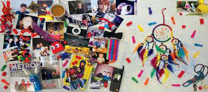
 |
| An example of one of the photos we took for the inside covers of the album. I brought in a lot of the photos, as well as the phone, colourful abstract ball, vintage camera, and the camera used to take the photo. Click to enlarge. |
Feedback and Changes
As we progressed through the creation of the digipak, we changed our ideas and received lots of feedback, which helped us reach a better final product. One of the first changes of this kind, and one of the biggest, was the move from having the band members go from large to small along the front like the flatplan, to instead having them in a straight line. We did it as the flatplan described at first, but realised something was wrong, yet couldn't think of any interesting alternatives. Audience members pointed out that, instead of what we currently had, just having the same images in a straight line would look quite good. Thus we proceeded with the ripped paper change mentioned above- we only had to create the paper effect, and didn't have to choose and edit different images of the band members. A side effect of these changes was to also make each band member more visible and recognisable through the move from full body longshots to midshots between the paper strips, especially the ones who were on the smaller end on the original design. This ended all our problems with the front cover in one fell swoop.
 |
| A segment of our album flatplan, showing the original descending size order, with Casey and Hugh as the two biggest. When we came to create this, multiple people confirmed our fears that the last two band members were too small. Click to enlarge. |
 |
| Our final album cover, showing everyone in a line. It is still interesting like the flatplan was, but the people are much more recognisable. Click to enlarge. |
The final change we made was to make the legal information a lot clearer. We were told by our teachers that important images such as the record label logo as well as the barcode and similar weren't very obvious, and after a few test prints one of the staff noticed that they were outside of the acceptable template borders for the digipak too. Thus we simply responded by re-organising everything, putting a strip of legal information at a good size across the bottom of the back of the album cover, and having all the track names above it. This both eliminated the issue of not having all the legal information in a good format, as well as the sizing issues with the template that might have ruined the final printing.
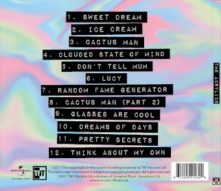
 |
| The back of our album cover, showing both the clear track names in their black blocks, as well as the obvious strip of legal information, including record label logos and barcode, across the bottom. Black and white makes these elements stand out against the colourful background. Click to enlarge. |
Our Progress
Overall I think the digipak creation went well. While we could have decided on a better position for the band members before proceeding with the creation of the digipak, and while we could have saved even more time by swapping computers at the first sign of an issue rather than pushing onwards and seeing what happened for a short time, overall we responded to every change we thought we needed to make, and ended up with a good looking digipak which fulfilled everything we wanted and needed it to.
Construction Post 4: Editing the music video
When we moved onto making the three main products of the project for the last few weeks of construction, we decided to assign leadership roles for each one. Jack is most proficient with Wix, having done the most work with it previously and over the last Summer, and thus was given the website. Me and Noa are probably both equally proficient at Premiere and Photoshop- however, I had some ideas for special effects for the video that I already knew how to do (whereas Noa didn't,) and Noa has more knowledge of masks in Photoshop than I do (which are a big part of editing the digipak,) and thus I lead the video editing while she lead the digipak editing. These leadership roles meant we were always making good use of time- if any of us had time allocated to media, we immediately knew which product to default to and work on. The leaders of each project did the majority of the legwork for each aspect, and made smaller decisions as they went along, while all three of us collaborated on the ideas and design and so on for each, and we made important decisions as a group. We did, however, all move around and work on each part of the project though- when someone had a particularly good idea for a product they weren't leading, or when extra work was needed for a certain product to keep it up with the other two, or so we could all learn how to use each program and put our own unique touches on each product, and so on.
As mentioned before, I lead the creation of the music video. Creation of the video was accomplished through the Adobe Master Collection CS5 suite of programs- Premiere for the actual editing, and Photoshop for certain special effects which were then imported into the Premiere video. Having everything laid out in a timeline in Premiere was very beneficial to the process of building up the video alongside the music track, and I learned a lot about the various tools and effects that could be dragged onto clips in the timeline to tweak lighting and add transitions and so on. In Photoshop, I expanded on my knowledge of what Photoshop could be used for- for example, I knew about viewing videos and animations using the 'animation' window and other tools, as well as how to create them using these same tools, but until this project I hadn't actually created any.
Our Challenges
We hit many challenges throughout the video creation process. One of the biggest and almost constant challenges was fitting in lip-sync across the entire video, while still using a good variety of shots. This necessitated cleverly choosing the right parts from our large range of takes, and fitting them in amongst the narrative shots, to create the kind of video we wanted. As our video is a hybrid of narrative and performance, both sides are equally important, so we had to make sure we had enough lip-sync throughout to balance and tie together the constantly changing narrative. The two best methods I discovered for overcoming this challenge were matching up the audio waveforms from the song and the clip, and cutting on obvious syllables by watching Noa's lips, and then matching that to the same syllable in the song.
Another challenge was how to make the narrative flow alongside the performance. The performance was carried by the progression of the song, but the narrative had to fit in with it and play in between and beside it while still remaining coherent. Different techniques were used- changing between scenes at certain points in the song, where the song rises or falls or the lyrics have some significance, using white flashes and other effects to show the jump between different places, and of course intensifying the coloured lights using grading so as to differentiate where and when different scenes are taking places, amongst other things. Overall I think both aspects of the music video really work well together, and blend together into one coherent video that both shows off the band's performance and tells a story.
My Contributions
My contributions to this product include doing the majority of the legwork- I decided what clips would look best when, cut and put in most of the clips, did most of the grading, put in most of the transitions and effects, synced everything up, and so on. I also used my knowledge to create the more visually dynamic pieces of the video- I created the trichromy shots by putting three clips into Photoshop and removing the colour channels from them to create a single composite video clip with 'colour ghosts.' In the previous stages of planning and construction, I worked towards creating these shots, by getting a slot to film footage for them onto our shootboard, and then directing everyone on where and how to stand and move to create the best footage for when I came to create the effect in Photoshop. I also created the explosion animations for the fight scene using Photoshop's animation tools, and more.
Feedback and Changes
As we progressed through the creation of this product, we developed our ideas and plans for what it should look like. We solidified certain ideas once it became apparent they would work well, and changed others based on our own better ideas as well as feedback.
A good example of this would be the shot when Casey has entered 'Alice in Wonderland' and sees herself in the mirror, revealing her costume has changed. We planned for this shot to be tricky, and actually filmed two versions. We first tried the most visually striking version, in which the camera is zoomed in on Casey's face, and it zooms out revealing it was zoomed in on her reflection in the mirror. However, teachers we showed the video to stated this shot was too dark, even after grading, so we changed to the other version of the shot in which the camera starts at a midshot of Casey in the mirror and tilts around to show a midshot of Casey herself. This shot was a lot nicer looking both before and after the grade, was suitably dynamic through the camera movement, and got a lot better reactions from the audience.
Another thing we changed, this time based on audience feedback, was the amount of dancing and fun movements we had in the video. After being told to include more of this by some of our target audience, we put more of the 'Singing in the Rain' shots in, as well as more of the relevant 'Sergeant Pepper' shots in. This was before we had reached the end party scene, so we ensured we had enough dancing and movement when we got to that as well. People generally responded well to these changes, with the people who had suggested the changes saying they preferred the new version and others seeing it for the first time saying they liked the energy of the video as well as the video overall.
One very big change we had to make based on both our own realisations after finishing the first draft and looking back at it, as well as feedback from primary audience members such as fellow media students and secondary audience members such as the media staff, was to make the video a lot faster. This consisted of finding certain moments where not much was going on, such as between lines or even between words where Noa wasn't performing a particularly interesting movement, as well as finding certain shots that just seemed slower or that lasted for a second or two without any particular changes. We then put various quick cut-aways into these places, resulting in a new draft purged of slower or less interesting visuals and more full of dynamic visuals.
Our Progress
Overall, I think editing the video was a success. We adapted to new ideas and feedback over the multiple weeks, and I finished the video in time for the deadline. While I think we could have had slightly better lighting at points (I think the 'Sergeant Pepper' and 'Alice in Wonderland' lighting is a bit similar at times, although I fixed this as much as I could with grading and believe it is an issue with how we filmed it,) and we could have used actual cardboard to create animations for the fight scene (I made the Photoshop animation look as much like cardboard as I could, but it was a later addition so we couldn't do anything physically,) everything still came out great, and we tackled every issue we came across and found creative solutions to them. The result is a very interesting video both matching our plans and excelling our collective vision for what it was going to be, and I am very proud of it.
As mentioned before, I lead the creation of the music video. Creation of the video was accomplished through the Adobe Master Collection CS5 suite of programs- Premiere for the actual editing, and Photoshop for certain special effects which were then imported into the Premiere video. Having everything laid out in a timeline in Premiere was very beneficial to the process of building up the video alongside the music track, and I learned a lot about the various tools and effects that could be dragged onto clips in the timeline to tweak lighting and add transitions and so on. In Photoshop, I expanded on my knowledge of what Photoshop could be used for- for example, I knew about viewing videos and animations using the 'animation' window and other tools, as well as how to create them using these same tools, but until this project I hadn't actually created any.
 |
| Premiere from Adobe Master Collection CS5. The timeline where the clips go stretches across the bottom, the clips and effects are found on the left, and the viewing window is on the right. The center box displays the properties of selected files. Click to enlarge. |
 |
| Photoshop from Adobe Master Collection CS5. The image is in the center, the tools are to the left, the effects are to the top right, and the layers are on the bottom right. Click to enlarge. |
Our Challenges
We hit many challenges throughout the video creation process. One of the biggest and almost constant challenges was fitting in lip-sync across the entire video, while still using a good variety of shots. This necessitated cleverly choosing the right parts from our large range of takes, and fitting them in amongst the narrative shots, to create the kind of video we wanted. As our video is a hybrid of narrative and performance, both sides are equally important, so we had to make sure we had enough lip-sync throughout to balance and tie together the constantly changing narrative. The two best methods I discovered for overcoming this challenge were matching up the audio waveforms from the song and the clip, and cutting on obvious syllables by watching Noa's lips, and then matching that to the same syllable in the song.
Another challenge was how to make the narrative flow alongside the performance. The performance was carried by the progression of the song, but the narrative had to fit in with it and play in between and beside it while still remaining coherent. Different techniques were used- changing between scenes at certain points in the song, where the song rises or falls or the lyrics have some significance, using white flashes and other effects to show the jump between different places, and of course intensifying the coloured lights using grading so as to differentiate where and when different scenes are taking places, amongst other things. Overall I think both aspects of the music video really work well together, and blend together into one coherent video that both shows off the band's performance and tells a story.
 |
| A segment from our music video. It shows the narrative transition from 'Singing in the Rain' to 'Sergeant Pepper,' and then the use of the slot machine as part of the 'Sergeant Pepper' narrative. Alongside this there are multiple shots of the band as well as the singer lip-syncing. Click to enlarge. |
My Contributions
My contributions to this product include doing the majority of the legwork- I decided what clips would look best when, cut and put in most of the clips, did most of the grading, put in most of the transitions and effects, synced everything up, and so on. I also used my knowledge to create the more visually dynamic pieces of the video- I created the trichromy shots by putting three clips into Photoshop and removing the colour channels from them to create a single composite video clip with 'colour ghosts.' In the previous stages of planning and construction, I worked towards creating these shots, by getting a slot to film footage for them onto our shootboard, and then directing everyone on where and how to stand and move to create the best footage for when I came to create the effect in Photoshop. I also created the explosion animations for the fight scene using Photoshop's animation tools, and more.
 |
| A sequence from our music video. It shows the blinking flash transition between the normal band shots and the trichromy shots, some of the different kinds of trichromy shots (longshots and close-ups, for example,) and it also shows the flash transition between the 'Mortal Kombat' narrative and 'Apartment' narrative. Click to enlarge. |
 |
| The 'Mortal Kombat' fight scene from our music video. You can see the practical effects we used, as well as the explosion animation I created, and even the fast blinking cut effect I used at the end of the shot of me playing the drums. Click to enlarge. |
Feedback and Changes
As we progressed through the creation of this product, we developed our ideas and plans for what it should look like. We solidified certain ideas once it became apparent they would work well, and changed others based on our own better ideas as well as feedback.
A good example of this would be the shot when Casey has entered 'Alice in Wonderland' and sees herself in the mirror, revealing her costume has changed. We planned for this shot to be tricky, and actually filmed two versions. We first tried the most visually striking version, in which the camera is zoomed in on Casey's face, and it zooms out revealing it was zoomed in on her reflection in the mirror. However, teachers we showed the video to stated this shot was too dark, even after grading, so we changed to the other version of the shot in which the camera starts at a midshot of Casey in the mirror and tilts around to show a midshot of Casey herself. This shot was a lot nicer looking both before and after the grade, was suitably dynamic through the camera movement, and got a lot better reactions from the audience.
| The old, unsuccessful costume transition shot. No matter what we did with grading and other tools, it always looked either too dark or too washed out at the beginning, and we didn't think any of the takes looked particularly good in terms of movement and speed and so on either. Click to enlarge. |
| The successful costume transition. It is a lot brighter and quicker, and overall better looking than the previous attempt. Click to enlarge. |
One very big change we had to make based on both our own realisations after finishing the first draft and looking back at it, as well as feedback from primary audience members such as fellow media students and secondary audience members such as the media staff, was to make the video a lot faster. This consisted of finding certain moments where not much was going on, such as between lines or even between words where Noa wasn't performing a particularly interesting movement, as well as finding certain shots that just seemed slower or that lasted for a second or two without any particular changes. We then put various quick cut-aways into these places, resulting in a new draft purged of slower or less interesting visuals and more full of dynamic visuals.
Our Progress
Overall, I think editing the video was a success. We adapted to new ideas and feedback over the multiple weeks, and I finished the video in time for the deadline. While I think we could have had slightly better lighting at points (I think the 'Sergeant Pepper' and 'Alice in Wonderland' lighting is a bit similar at times, although I fixed this as much as I could with grading and believe it is an issue with how we filmed it,) and we could have used actual cardboard to create animations for the fight scene (I made the Photoshop animation look as much like cardboard as I could, but it was a later addition so we couldn't do anything physically,) everything still came out great, and we tackled every issue we came across and found creative solutions to them. The result is a very interesting video both matching our plans and excelling our collective vision for what it was going to be, and I am very proud of it.
Subscribe to:
Posts (Atom)