Our opening credits, and in fact the whole opening sequence, start with the Film4 Productions animated logo and then the Screen Gems animated logo. This transitions into a black screen with our first title, stating that the following film is a Film4 and Screen Gems production. Our opening shots are an extreme close-up montage of different body parts of our characters- titles will appear over these shots.
Credits include:
'directed by r.r. banks,' 'produced by jack edmondson,' 'screenplay by mary pan,' 'cinematography by emilio francischelli' and 'music by sayo ajoje.'
They are all in lower-case to try and capture the casual teen aesthetic, and this is where overlaying them over shots of the teen characters helps, but they are also going to be bold and white in a striking font to ensure they still make an impact and don't detract from the cinematic quality of the credits sequence. As we haven't planned all our shots in full quite yet, so we have not got solid plans for where exactly they will be positioned, but we intend to stick to corners and edges when we can, but try to swap positions around between shots where possible to keep the credits dynamic and less boring. There will be one final title right at the end of the opening, which is the film title itself, in the same style as the previous titles, but bigger and central, and possibly with some sort of shadow or highlight effect to make it stand out more.
Looking at titles helped us start to define the first shots of the opening sequence, which really helped, as a strong start is needed to grab attention and set tone. The wider impact on our project thus is actually quite high- although titles are a relatively simple thing, the style they set as precedent must also be found throughout the rest of the project to ensure synergy, and thus this stage of development has effected more than just what words come up on the screen.
~~~~~~~~~~~~~~~~~~~~~~~~~~~~~~~~~~~~~~~~~~~~~~~~~~~~~~~~~~~~~~~~~~~~~~~~~~~~~~~~~~~~~~~~~~~~~~~~~~~
My finished music video:
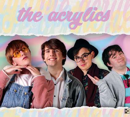
My front digipak panel:

Right-click the image and open it in a new tab for a bigger version.
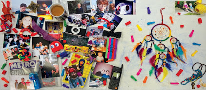
My inside digipak panels:

Right-click the image and open it in a new tab for a bigger version.
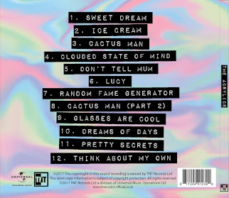
My back digipak panel (with album spine:)

Right-click the image and open it in a new tab for a bigger version.
Tuesday, 17 January 2017
Subscribe to:
Post Comments (Atom)


No comments:
Post a Comment