My finished music video:

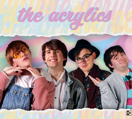
My front digipak panel:

My front digipak panel:
Right-click the image and open it in a new tab for a bigger version.

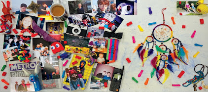
My inside digipak panels:

My inside digipak panels:
Right-click the image and open it in a new tab for a bigger version.

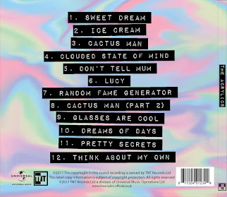
My back digipak panel (with album spine:)

My back digipak panel (with album spine:)
Right-click the image and open it in a new tab for a bigger version.

Click the image below to open my website in a new tab:

Sunday, 26 November 2017

R+P Post 27: Casting

When he had decided on the band members and their personalities, we had to cast them. We decided to go with our original plan to use all three of us as three of the band members, to ensure that our cast was committed to the project- if we had gotten someone outside the group, there is a chance they would have been less committed to the project and caused issues later down the line. However, we did need a fourth person, so we asked Tom Brown, a mutual friend of all of us, and someone who did Media at AS. Out of everyone we could have picked, he was the best choice, as he is a good actor who fits the role of Terence Kitchener really well, and we know he won't let us down because of our good relationship with him.

The process of casting involved seeing if we could fit the roles assigned to us- especially for the lead singer. To this end, we did a Screen Test to see how we all worked together, if Noa looked and sounded like she was singing the original artist's voice, if everyone could emulate the personality of their band character through their performance, and if we all fit our roles. By the end, we were happy with our casting decisions.
Our Screen Test video. While the performance isn't as refined as we hope the final product will be, something we will be working on with rehearsals and so on, we think that each of us have our roles down to a certain degree, with the correct gestures and facial expressions. Click to play.

Our final cast list is thus as follows:

Casey Tyler- Noa Craig
Noa is a confident performer who has performed in drama productions and similar in the past- she thus knows how to act and isn't camera shy, which is important for the lead singer and personality/face of the band, and is especially important for the happy-go-lucky personality of Casey Tyler- she has a fairly similar personality in real life, and we were able to partially tailor the role to her, but not to the detriment of our overall plans, i.e. had we decided on a different personality for Casey that we liked more but was different from Noa, we would have went with that, especially as Noa is an accomplished actress and would be up for the task. While the song we chose had a female singer, and thus Noa as the only female member of the group seemed like an obvious choice, we didn't want to pick her simply based on that- however, after testing her out in the role, we found she fits very well with the original artist's voice and the atmosphere of the song, as well as with the personality of Casey Tyler and the planned atmosphere of the music video.
Noa in her Casey Tyler band costume. Here she is posing as if for a dramatic promo shot. Click to enlarge.
Hugh Tyler- Jack Edmondson
Jack is a drama student and has been involved with many plays and even musicals in the past. He thus is no stranger to playing the part of a character or a music performer, and being a longtime friend of Noa he works well with her- which is important, as while Hugh likes to act cooler than Casey, he still has to have a good sibling relationship with her while performing, and match her enthusiasm. Jack is a naturally enthusiastic person, so again he fit very well. He actually has had experience playing a guitar in an indie pop music video before, through the Echosmith music video remake task, and thus he also already has experience in a similar role.
Jack in his Hugh Tyler band costume. In this picture, he is trying to capture the cool side of his character, which we can really bring out more when he is alone and we don't have an opportunity to show his relationship with Casey. Click to enlarge.
Guy Chapman- Emilio Francischelli
I was selected for the role of Guy Chapman- as my other two group members are more accomplished actors, it makes sense that they were given the two lead roles- and then out of the two remaining roles we decided on Guy, as I fit his personality, gestures, etc. better than that of Terence. I have had some experience being in a music video and in front of a camera before, for example in the Echosmith remake and other previous media projects, but I am a bit less confident than some of my peers, so the quieter role of Guy suits me very well- I can still act well enough to be convincing, but don't have to be the face of the band. However, I do like to mess around with my friends and am quite outgoing when I get comfortable, so as I build up confidence in the role I should also be able to tackle the mischievous side of Guy's character as well.
Me in my Guy Chapman band costume. Here I am trying to pose as if I am in a promo shoot, in order to build up my confidence and experience in playing the role of Guy in front of the camera. Click to enlarge.
Terence Kitchener- Tom Brown
As we had run out of group members to cast by the time we came to cast Terence, we thus had to cast outside of the group- however, this meant we could choose someone perfect for the role. We decided on Tom, both because of his good relationship with all of us, but also for his experience in being a media student up to AS level and in taking part in many drama productions, often alongside Jack. While we know him as a down-to-earth and friendly person, even when joking about with us and other friends he plays the role of the "straight man" very well- this, combined with his acting skills, means we think he will nail the role of the slightly smug and more serious personality of Terence Kitchener. Our friendship should cover the other side of his character, in which he interacts and has fun with the other band members.
Tom in his Terence Kitchener band costume. In this picture he is attempting to play up the more serious facial expressions associated with his role, and succeeding quite well. Click to enlarge.
Other
As part of the casting process, we also had to cast people as extras in the party scene. As we would be dealing with a large number of people, we decided to make a list for better organisation. This list consisted of people who we all thought might be suitable for the role of a person at a party, while still being reliable. We narrowed this list down to five people after seeing who was available on the days we were thinking about shooting the party shots on, and then worked with them from there in order to secure costume and some basic personality for their characters and so on. The final list consists of Ray Baker (a fellow media student,) Lily Mo Browne (a friend of ours,) Hugo Perrot-Barnaby (a friend of Noa and myself,) Caleb Wycoff-Smith (a friend of Noa,) and Luciano Francischelli (my brother.)
The preliminary list of possible extras. It is extensive, as we created it with the intention of cutting it down to a shortlist, and visible is some evidence of us eliminating people as options for reasons like availability. Click to enlarge.
A group photo showing all four of us, the band members, alongside all five of the extras in their costumes. We know each of these people personally, and not just as acquaintances but as friends and family, so despite the larger number of people to organise, we think we will be able to use our directing and organisational skills to get them to perform how we want them to, while they remain receptive and willing to help. Click to enlarge.

R+P Post 26: Set design, locations, and props

We also had to finalise the details of our set design. Our plan is for quite a minimalist look, with only a few set props, most of which we could make ourselves in order to maintain our DIY cardboard aesthetic. Otherwise, we wanted complete control over the set so that we could create the pastel, dreamlike side of our aesthetic, and thus we turned to lighting. We will be shooting entirely in studio, so that we can use various different lighting set-ups on the cylorama, and thus we did a reccie of the studio to learn a bit about the lights, and even started working on the set-ups. Our plan is to have a distinct colour for each set-up, to complement the props and costumes and even themes of the set-up. For example, the "Alice in Wonderland" set-up is purple, to complement Casey's blue dress and the green of the tree (if any of the props were purple or even pink the purple might interfere,) as well as to reference the purple Cheshire Cat from the same source media.
The studio as we found it when we went in for our reccie. The cylcorama ensures a blank white canvas for us to shoot on, and the various lights you can see above allow for precise manipulation of the colours displayed. Click to enlarge.
Jack being guided through how to operate the lights from the floor, while Noa and I watched and learned alongside him. You can see our "Alice in Wonderland" lighting set-up in the background, or at least a preliminary version of it, with the tree prop in the middle of being set up. Click to enlarge.
We took inspiration from a few different videos. We noticed having a plain studio is quite conventional for music videos, and thus we adapted this convention to our own needs. Studio-shot music videos tend to have only a few props so that the aesthetic can be carefully constructed and controlled, in comparison to on-location videos which tend to have a lot of props in order to simulate real life more.
Some of Jessie J's music video for her song "Price Tag." While it is somewhat outside of our genre, this was still an influential video on us because it has very similar set design to what we hope to achieve. There is a plain white room with different colours used for different scenes, with only one or even no big props. We also hope to emulate the success of songs and videos such as this one. Click to enlarge.
Some of Echosmith's music video for their song "Cool Kids." This is a song and video we were already familiar with, from a band that has been an influence from within the genre throughout the project, so we looked to this video for inspiration. While they use less colours than we are planning to, they still have a lot of variation in the kinds of lighting they use, and they do have at least some colour variation between white, grey, and pink. Click to enlarge.
Most of the props that we are planning to use to build the sets we are going to make- besides the sofa and some other miscellaneous things. They are directly inspired by the lyrics and our interpretation of them, as well as the pieces of media we are referencing. For example, we looked at the lamppost in "Singing in the Rain," and then decided to replicate it in cardboard and paper to fit our aesthetic. It is going to be the only set prop in its set-up.
The lamppost from "Singing in the Rain." We looked at images such as this for all four pieces of media, in order to determine if we'd need set props, and what they should be if so. For this one, the lamppost is integral to this famous scene, and very recognisable besides, so we decided to rework it in our cardboard aesthetic. Click to enlarge.
A photo of Jack working on the lamppost prop. We used a layer of cardboard as the structure of the post, and then surrounded it in black paper to make it look more similar to the original, while retaining the homemade look. We tried to shape it into a recognisable approximate version of the original. Click to enlarge.
A picture of the completed lamppost, in the wings of the studio waiting to be used. We built it on top of a 'swingball' base to aid in standing it up, and built some small lights into the paper approximation of the lamp to make it give off a nice glow and resemble the light of the original a bit more.
We followed a similar process for every single set prop- it differed slightly when it came to set-ups like the apartment, as that one is set in the 'real world.' Thus we just used a sofa, and in certain shots we used as normal props various items relating to the pieces of media throughout the dreams in the video, such as a "Singing in the Rain" VHS box and a "Sergeant Pepper's Lonely Hearts Club Band" vinyl record cover.
Our set props for each set-up that required them. Certain set-ups, like Mortal Kombat, had normal props that we created by hand in a similar fashion to certain props on this list, but not free-standing pieces of set design like the ones shown here.

R+P Post 25: Costume, props, and make-up

We decided to finalise both the costumes and props we would need for the video, since we had already figured out and consolidated our ideas for the band's fashion, style, and aesthetic, as well as all the different set-ups and shots we would need, which already necessitated figuring out all of the props and costume changes to some degree. We first simply wrote out everything on paper to get our ideas down, and then we worked from there.
The first page of our preliminary costumes sheet. We figured out most of the basics for each person's costumes- everyone has a 'performance' costume they wear for the band shots, and a 'narrative' costume they wear when they are acting the part of a character from a classic piece of media. Additionally, Casey has an extra costume for the narrative sections we added later- pyjamas for the shots in her home before and after she has the dream. Click to enlarge.
The second page of the preliminary costumes list. We wanted all the band members to look fairly similar in terms of performance costume- that's why they are all wearing different coloured shirts on this ideas sheet. We later expanded on this idea by having everyone wear a shirt (or in Casey's case a jacket) of a similar colour to the primary colour of their narrative costume, but more pastel to fit with the band's aesthetic. Click to enlarge.
The narrative costumes were fairly simple, as we simply had to replicate the costumes of the chosen characters- Alice from "Alice in Wonderland" for Casey, Gene Kelly from "Singing in the Rain" for Hugh, Scorpion from "Mortal Kombat" for Guy, and one of the Beatles from the cover of their album "Sgt. Pepper's Lonely Hearts Club Band" for Terence. We also decided to give Casey some make-up so she would match Alice better, and then give the rest of the band members the standard make-up to make them look good under studio lights, and no more. This had the added benefit of making Casey stand out more, as she should as the face and major personality of the band.
The visual reference for Casey's Alice costume. We used older versions of the characters in keeping with the song's themes and the video's storyline- this we went with the older but very recognisable 2D animated "Alice in Wonderland" film, rather than more recent adaptations in live-action and similar. We imitated both the costume and the make-up, such as the pink lipstick and eye make-up. Click to enlarge.
The visual reference for Hugh's Singing in the Rain costume. It is a screenshot showing Gene Kelly in the most famous moment of the film, where he is dancing and of course singing in the rain. We simply had to get a nice suit costume together, as well as a similar-looking hat, and we noted down the umbrella for the props list later on. Click to enlarge.
The visual reference for Guy's Scorpion costume. As with Alice, we went for the classic, recognisable version of the character's costume from the older games to fit with our ideas. This also made it easier for us when it came to creating the costume, as newer versions of this character from the newer "Mortal Kombat" games have much more elaborate costumes. Plus, the older version has a stronger yellow, which we decided would look good in the video. Click to enlarge.
The visual reference for Terence's Sgt. Pepper costume. Out of all four colours, we chose red, as we already have bright blue and bright yellow narrative costumes, and we thought red clothing needed to build the costume would both be easier to find and look nicer alongside the other costume colours in the final video than pink clothing. Click to enlarge.

We then moved on to the performance costumes. We looked back at our influential artists for ideas on what kind of clothes we should be wearing- we already knew the colours, as the colour scheme came from our band and video aesthetics. This culminated in the three male band members wearing black jeans, with a pastel coloured shirt that somewhat corresponds with the colour of their narrative costume, and Casey herself in a blue denim jacket and blue top to match her Alice costume, also with black jeans. In this way we have created synergy with the band's overall aesthetic, such as the clothes they will be wearing on promo shots on the website and such, but we have preserved the video's unique aesthetic too. Someone from our target audience said "the costumes make the band look like they belong together," so we seem to have been successful.
A picture of Lucy Spraggan. Artists like Lucy Spraggan, as mentioned previously on this blog, have been very inspirational for us when developing costumes for our band. We looked through all our old reference photos as well as some new ones in order to find the best fashion choices for our music video costumes, and this photo of Lucy Spraggan was particularly useful for Casey's performance outfit. Click to enlarge.
A picture of Echosmith. They have been a big influence throughout, and at this stage it was no different- we liked their different shirts and varying accessories, and although we were looking primarily at fashion and clothing styles rather than colours, the colour scheme in this photo (as well as others) did have some influence on our music video costumes. Click to enlarge.
A picture of New Young Pony Club. We investigated different bands wearing matching costumes, and found it fairly frequent both inside and out of the studio, and both inside and outside music videos. This is a particularly extreme example in that they are all wearing the same t-shirt, but it was helpful in illustrating the extent of this convention, which we used in our band costumes. Click to enlarge.
Eventually, after various preliminary ideas sheets and research into different costumes, we decided to try and get all the costumes together. We got as many possible options for each outfit as possible, and then tried them out- once we were happy with them, we took photos and used them to create a list of all our costumes. The narrative costumes were a little trickier, as we had to actually create some of them (but we did that as part of this process too,) and we ended up using some of the budget on an "Alice in Wonderland" costume (the exact Amazon listing for this can be found here.) Once they were completed, we took more photos and added them to the rest.
A list of all of our costumes, as well as the people who ended up wearing them, once we finalised the casting.

We also refined our make-up ideas somewhat at this stage, to better fit with the eventual final costume designs. The two people with the most costume-specific make-up were Casey as Alice and Hugh in the band. We tried to replicate Alice's make-up as best as we could, to add an extra layer of authenticity. With Hugh, we wanted to explore his personality and stage prescense a bit more, as he is arguably the next most important member of the band after Casey, and he shares a lot of screentime with her because of their brother-sister relationship. We therefore decided to give him some 'guyliner,' and this eyeliner really helped to make him look more outgoing and interesting, as if he had dressed up and done his make-up to look good in the video alongside his sister. A male band member wearing eyeliner also breaks traditional gender norms somewhat too, which feeds into the band's welcoming nature that they use to appeal to their young target audience.
We looked once more to our reference pictures of older depictions of Alice. While make-up differed, we noticed a few common traits, and we picked and chose some of the less common but interesting traits we also wanted. We ended up going with the recognisable pink lipstick, as well as eyeshadow (which we added glitter to so it would stand out more,) along with fuller eyelashes. Click to enlarge.
A picture of Brandon Flowers from the Killers. We looked to various male icons in the past and tried to find some kind of make-up that set any of them apart, in order to influence Hugh's make-up. While the Killers are closer to indie rock than our chosen indie pop, they are still very similar to our other influences and our band in a lot of ways, and besides that Brandon was one of the first big stars to break the norms of male fashion by wearing make-up. Click to enlarge.
The only other costume considerations we had to work on was the range of costumes for the party scene at the video's climax. To take some of the pressure off of us at this busy time so we could focus on other parts of the project, and to add to our video's authentic and DIY aesthetic, we asked all the people we had cast for the party scene to suggest their own costumes for this scene based on what they had access to. We gave them some guidelines and vetted their suggestions, and ended up with a wide range of costumes- ranging from other recognisable characters from pieces of media, such as Luigi from "Super Mario Bros." and Shaggy from "Scooby Doo," to costumes that were simply visually interesting, such as a human-sized fried egg.
The people we ended up casting as extras in our party scene in their costumes. As you can see, their is a fairly large variety of costumes, and we tried to show each costume/character's personality while filming the video- for example, the ghost chased Shaggy, while Luigi did some jumping. Click to enlarge.


Alongside costume, we worked on our props list. Like with costume, we had some ideas on what we would need for each set-up and shot thanks to our storyboard and such, so we decided to make a props list to consolidate our ideas. Like other paper plans of this nature, it helped us finalise our ideas by pulling together and organising all of them in one place for the first time.
The first page of the props list. As you can see, we divided the props up in a similar way to the storyboard (which we were using to help us create this list) in order to aid organisation. We also noted which props we would have to create to further help organise us, as this ended up being quite a few props because of our DIY and cardboard-style video aesthetic. Click to enlarge.
The second page of the props list. This page also contains all of the musical instruments we needed- it was during the process of creating this list that we finally decided exactly what each band member was playing, as previously Guy and Terence could have swapped instruments (either with each other or to a different instrument completely) anytime before the video. While this was incredibly unlikely, especially as we had built their personalities while knowing what instrument they played, finalising this decision based on props we knew we had access to was quite good for organisation. Click to enlarge.
The next step was gathering all the necessary props. Most of the props we provided ourselves, either as we owned them or knew people who had them and would be willing to lend them to us. We also got a few props through school, such as the Drum Kit, and we purchased the TV simulator with some of the budget as we knew it would provide a great effect but no-one we knew had one (the exact Amazon listing for it can be found here.) That left the props we had to make, so we created a few preliminary designs for these props, gathered the necessary materials, and met outside of school a few times in order to make them.
An example of a preliminary props design sheet. This page shows some of the Mortal Kombat set-up's props, such as what would eventually become the "Fight!" sign, as well as the health bars that we would hold up above the actors. Click to enlarge.
The final evolution of the "POW" sign on the design page above. When creating it, we weighed up the practicality of our plans and adjusted them accordingly. Thus, instead of string, we will just have someone hold the sign, and of course the text itself has been edited too. Click to enlarge.
The final versions of the health bars. They also changed slightly from the design sheet, with the names hanging down with string instead of being on top of the bar- this was easier to make, made both the bar and names clearer, and is more accurate to the actual video games we are referencing in which the names often sit below the bar. We provided the cardboard, sticks, and string, and used the school's paint. Click to enlarge.

R+P Post 24: Planning my digipak panels

Similar to the process we followed with the website, once we had built up a large set of influential album covers through research, we could move onto planning our own. We set to work with knowledge of relevant conventions, as well as what we wanted the album to look like in order to comply with the overall aesthetic of the band, while having synergy with the music video and website. We created a final flatplan to represent the consolidation of our ideas into one document.
The front and back panels of our flatplan. We have included genre conventions such as the border, as well as important but more general conventions such as having the band's name on the front and the song names on the back. We gave it a bit of unique flair to represent our band's personalities by having a line-up of the band (conventional for debut albums as people seeing the album and thus band for the first time must be able to gain some information about them,) but making the sizes of the people in the line-up go down in descending order, but not to too small a size, as the smallest person must still be visible on a CD-size case.
The front of Echosmith's album "Talking Dreams." We really liked this one- it has the conventional border, the band and album names large and obvious, and a very clear colour scheme to introduce the band. We sketched our flatplan and thus it is in black and white, but we specifically annotated that we were going to have a lot of colour, in part due to the influence of this album, as well as due to audience input, in which audience members stated they wanted to see lots of colour that lined up with the band's aesthetic. Click to enlarge.
The front and back of New Young Pony Club's "Fantastic Playroom." This is their debut album, and thus as is conventional the band appears on the front. They are very clear and easy to make out, due in part to the plain background, but this doesn't impact the overall design on the album- in fact, it compliments it, as it benefits its strong white and red/pink colour scheme that extends from the front onto the back. The text is also clear and easy to read, so you can see the conventional and important information such as the band, album, and song names. Click to enlarge.


The inside panels of our album. We drew in the CD's location in order to design around it. We wanted more personality to be available in these sections, to further inform and draw in people who liked the cover enough to open the album. Thus we settled on a picture of a table, to provide a nice background, with a lot of things relevant to our band sitting on top- this includes relevant music equipment such as a guitar pick, microphone, and drumsticks, as well as pictures of the band and its members. We noticed things like this on a fair number of albums we researched, and furthermore, many audience members mentioned to us that they quite liked the idea as they didn't see it as often as plain inside spreads. Click to enlarge.
All panels of "California Nights" by Best Coast. This was also a very influential album- it has the border and image of the band on the front, as well as clear and readable text showing the album, band, and song names. Inside, there are a lot of pictures of the band, to further show off their personality and get people invested in them, especially since people who have opened the album to look at the inside are already somewhat interested due to the front of the album. Click to enlarge.

R+P Post 23: Planning my web pages

After looking at all the conventions of websites in our genre of indie pop, we moved on to designing our own. We used our knowledge of the general structure of such sites, as well as the smaller yet essential things that also contribute, in order to construct an eye-catching website plan that shows off our band and their aesthetic, helping sell them to the audience, while still adhering to convention. One key convention that really guided our flat plan is that a lot of websites, of the kind we are looking at and trying to fit in with, present everything on one page, with each section available by scrolling and the navigation bar following you down and providing a quick way to jump to each section.
Our final website flat plan, that consolidates all our individual ideas into one, as well as showing off the conventions that we all included in our individual flat plans. Click to enlarge.
We have a header image of the band, to instantly show viewers who we are, and hopefully give an idea of our aesthetic and music if the promotional shots we take are good. A navigation bar setting out everything a visitor could need in a clear way is present above, and it will follow when the page is scrolled down, providing a constant opportunity for interaction through the social media links and thus encouraging people to get immersed in the site and thus the band. This will make them more likely to like us, and thus more likely to buy our music and/or merchandise. To this ends, buttons that link to our music on iTunes, Spotify etc., to our store, or even to our tour tickets are frequent and obvious, providing ways to interact in and of themselves, while remaining ways to buy. We may also have a pop-up that appears when you first enter the site, informing people of our new album and music video, and how they can buy it. The video itself is also near the top of the page so that people can interact by clicking it, and then experience a three minute long showcase of our band's music, personalities, aesthetic and more to draw the audience in. The entire website will have a colour scheme and general aesthetic that matches our band and their video, and this synergy continues into the social media pages, which are also ways to advertise things like band merchandise and music.

We each did a flatplan before the final version. We each focused on different aspects despite sharing certain key conventions, such as the navigation bar, and these aspects guided the final version. Noa really focused on the infinite scroll, being particularly inspired by the website of Alvvays. We decided it was a good idea because it was conventional, but also because it provides everything the audience could want on one page, including information on the band as well as ways to buy. However, multiple audience members told us they thought the main column of the website was too small, with the art on either side taking up too much space, and so we changed this in the final version by widening the main column and fitting more in.
Noa's flatplan. As you can see, she has left a long thin space for the majority of the website, while still adhering to the conventions of having a navigation bar and set of images at the top, as well as an obvious 'buy' button. Click to enlarge.
Part of the infinitely scrolling blog of Alvvays' website. You can see the clear influence on Noa, with a fairly thin strip for infinitely scrolling information surrounded by a pleasing design that matches the band's aesthetic. Click to enlarge.
I focused on delivering as much information as possible as quickly as possible, to capture the attention of audience members who visit the website. I noticed this was conventional, with large headers on websites like that of Echosmith, that show off a music video or set of images or both. We ended up including a fairly dense block on information at the top of the website on our final flatplan- the audience wanted a title at the very top too, though, to introduce the website before this block of information. Thus this was added to the final design.
Part of my flatplan. This segment shows my idea for a navigation bar with a lot of different options, including all the standard opportunities to buy such as 'tour' and 'shop,' and extra ways to interact and get acquainted with the band like 'win' and 'about' respectively. The 'win' section is conventional, but slightly less common than, say, the 'music' button, but it made it from my flatplan onto the final version.
The top of Echosmith's website, which provides a lot of information at once, and which was one of my favourite inspirations. The header image is also the thumbnail for the band's most recent music video, and the navigation bar is clear and easy to read, with the band name as well as all the relevant buttons. The colour scheme is instantly clear. Click to enlarge.
Jack liked the idea of having a set of images that people could click through as the header of the website. This provided a way for the audience to get a quick idea of what our band is like, while also allowing for some interactivity. He then placed the music video under this, so that people who have been drawn in enough at this point can scroll down and see a whole new section of the site with a video for them to watch, rather than wasting our 'ace in the hole' right away. This idea made it into the final flatplan, and Jack was inspired by Sheppard's website.
The relevant section of Jack's flatplan, showing the image box and arrow keys to go through all the images, and then the video right underneath rather than being part of it. Click to enlarge.
Sheppard's website. The navigation bar is at the top, and then their is a long picture showing a promotional picture of the band and then some tour information as you scroll down. Then when you finish scrolling through the image, you reach a set of two videos to further interact with. Click to enlarge.

R+P Post 22: Planning my promo shots

We decided we needed two sets of promo shots- one lot in the studio, for the album cover as well as the website, and one on location, mostly for the website and associated social media. We wanted a good mix of professional-looking studio pictures and down-to-earth pictures outside of the studio, so that we can show off both our band's attitude towards music and their individual personalities outside of work.

We decided to look at the various promo shots of some of the influential bands we researched in order to get ideas for our own promo shots. We noticed certain kinds of promo picture coming up time and time again, and decided we could use these conventional shots to our advantage. We didn't do a lot of flat plans for individual shots, because we wanted a naturalistic indie style even in our studio shots, but to compensate for this we kept these images with us, as well as all our other influential images that we found through research, in order to reference them and imitate them wherever fitting.
An intimate shot of Alvvays. They band members are touching and leaning on each other, and this really helps to show off their closeness, personalities, and relationships, and show off the real people behind the band, despite the sterile studio setting. Click to enlarge.
A similar shot of the band McFly. Once again it is in a studio, but each individual band member's personality is shown off through their poses and facial expressions, and you get a sense of the good relationship between them through their close proximity and the fact that they are leaning on each other. Click to enlarge.


Some artists also have other kinds of shots to show off specific relationships. This is a promo shot of Best Coast, a duo rather than a full band, and thus they are more close than the average band. You get a strong sense of each person's personality and their specific link, with the singer laughing and pointing to the guitarist. Shots like this would be especially good for illustrating the relationship between Casey and her brother Hugh. Click to enlarge.
A shot of Kings of Convenience in a similar vein to the Best Coast one above. Here, the hand resting on the shoulder and the 'slice of life' look of the promo shot (and it is still clearly a promo shot, as seen through the eye contact with the camera,) as if the camera was interrupting a conversation, really cements the good relationship between these two specific people. Click to enlarge.


A promotional shot of The Smiths. Sometimes a little bit of messing around can really endear people to the artist- unlike dramatic poses in a studio, a more human connection can be made by seeing people in real places and situations, playing around like any person would with their friends, or in this case, bandmates. Click to enlarge.
A shot of Alvvays outside the studio. Here all the band members are messing around together, lifting up the singer and either acting humourously deadpan or smiling at the situation. This makes for an entertaining shot that people will like seeing, and thus they will end up liking the band too. Click to enlarge.


Echosmith sitting in a line. While it is taken outside of a studio, the bench forces them to be in order and gives off the sense of a professional shot of the whole band together (rather than a candid one,) but the location still gives off a feeling of authenticity. Click to enlarge.
Sheppard sitting in a line. Each band member is clearly visible and the shot is quite clean and ordered, as opposed to the messing around and candid shots that sometimes happen outside of the studio, but their personalities can still be gleaned somewhat from their clothing, body language, etc. Click to enlarge.