My finished music video:

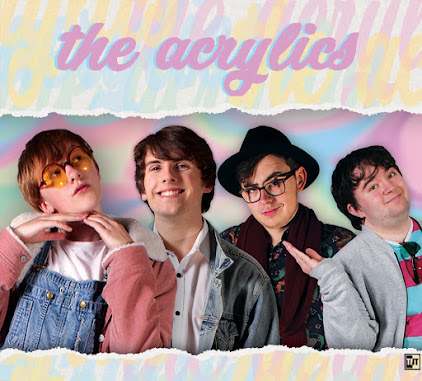
My front digipak panel:

My front digipak panel:
Right-click the image and open it in a new tab for a bigger version.

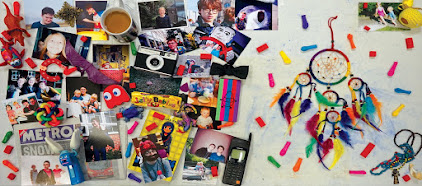
My inside digipak panels:

My inside digipak panels:
Right-click the image and open it in a new tab for a bigger version.

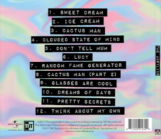
My back digipak panel (with album spine:)

My back digipak panel (with album spine:)
Right-click the image and open it in a new tab for a bigger version.

Click the image below to open my website in a new tab:

Sunday 15 October 2017

R+P Post 11: Artist websites that have inspired and influenced my ideas

We approached the research for the third construction task in the same way as the other two- looking at a lot of influences and getting a general idea of conventions and ideas, and then focusing on a few particularly influential ones. We noticed there was almost always some kind of navigation bar, with an integrated or separate bar for social medias such as Facebook, Twitter, Instagram, Tumblr, etc. as well as ways to consume and buy the music, such as SoundCloud, iTunes, Google Play Music, etc. Certain pages such as 'tour' and 'store' were almost always present, with ones like 'contact' and 'news' and 'gallery' also appearing a lot. The sites invariably had a lot of options for interactivity, such as clicking around pages, playing videos etc. as well as many ways to give money to the band through tours, purchasing music and merchandise, and so on. A few other conventions we noticed on a few websites that we are quite interested in would be the inclusion of a charity link on sites like Modest Mouse's official site, and a welcome screen that informs of a new album that must be clicked past to get to the main site, such as on Los Campesinos' website.

The first is the website of the band Echosmith. This website is quite simplistic and conventional- the homepage is one long scroll, with a navigation bar on the top that scrolls down with you and allows you to always access the other pages on the site. We found it particularly interesting because of this feature, but also because the scrolling homepage contained every section of the website. While clicking the page names in the navigation bar does take you to a separate page, scrolling down on the homepage gives you an overview of each section of the website- this makes it easier for users to engage with the band, as they don't have to spend much time to see what they and their website's pages offer. Scrolling to the very top shows a contact bar, and the header image for the website is actually one of Echosmith's recent videos- these two things provide interactivity, synergy with the band's social media and music, as well various ways to buy. Not to mention the ever-present (until you click the 'X') pop-up that asks you to sign up to the band's newsletter. It also has a simple colour scheme that reflects the colour scheme of the band's latest album, while not getting in the way of all the links and information which provide crucial ways to interact. Overall it is a very well-designed website that presents everything quickly, effectively, and in an eye-catching way, which we could take many cues from.
Echosmith's website. Note the video taking up the top part of the website, as well as the clear navigation bar with links to other pages as well as a store. Also seen is the topmost contact bar with ways to view social media and buy music, as well as the pop-up in the corner for the newsletter, all following the same colour scheme. Click to enlarge.
Another section of Echosmith's website. Note how the navigation bar and pop-up have moved with the scroll, as well as how 'tour' and 'news' have their own sections on the main page ('music' has been scrolled by.) The colour scheme continues, inspired by the band's recent album cover. Click to enlarge.
Another website we looked at is the site of Alvvays. It is also mostly focused on a single page, with links on a navigation bar that provide ways to buy and interact upon entry of the site. The rest of the site is in blog format, showing news about the band, and it scrolls endlessly until you reach the first post from 2012. The image that greets you when you first open it is a huge stylised image with a small but very eye-catching animation around the order button- we were interested in this because the style seems similar to what we are already considering, plus it is a convention and a good idea to put such an obvious way to interact and buy in the first page of the website. Other conventions are present, such as a newsletter sign-up and tour page, with smaller versions of these things appearing on the side-bar, and social media links are given prominence in the navigation bar. Overall it is a more unique website than many we looked at, with an inspirational visual style, but it still follows quite a lot of conventions.
The first page of Alvvays' website. The navigation bar is quite small, but still eye-catching, because the black-and-white colours make it very easy to read and contrast with the rest of the website. Thus the eye is drawn to both the interesting image that references the band's new album and has an opportunity to buy, but also to the bar with even more ways to interact through social media and buy through the 'store' and 'tour' pages. Click to enlarge.
The beginning of the rest of the site. It is in blog format, and the navigation bar doesn't follow, but the newsletter sign-up and tour dates are present in the sidebar, and the blog itself serves to promote the band further as it is effectively a news feed telling of said tours as well as album releases and such. Click to enlarge.
Chvrches' website is another one we looked at. It is another one that is focused on a single page that contains everything, with a few other pages, rather than a traditional website with a homepage and then separate pages for each section. It opens on a pop-up informing people of the new album, showing its album art, and providing various different platforms to buy it on (with one option including a t-shirt.) Pop-ups seem to be a convention that is used to engage viewers and try to entice them to buy. Past the pop-up, the website has a very strong visual style, mimicking the front of the aforementioned new album. A grey box on the side opens up what would the navigation bar on other sites, and a pink box under it opens a contact bar, that contains many social media platforms to interact with as well as yet another chance to go to one of the various online stores and buy Chvrches' music.
The opening screen of Chvrches' website, showing the pop-up. It gives a brief overview of the album as well as many ways to purchase it, and serves a similar purpose to the welcome screens we saw on other sites. Click to enlarge.
The main page of the website with the sidebar open. As you can see all the social media and buying options are presented when you click the pink box, in a dark black to stand out against the plain pink, providing interactivity, synergy, and ways to buy.

No comments:

Post a Comment