Like with our music video research, we looked at a lot of different album covers, that all influenced us in some way. However, we did end up focusing on a few albums that were especially useful for informing our ideas. We noted the presence of the artist on the front of many of the albums, as well as the relative plainness of the inside and back so that important information isn't lost amongst clutter.
One of these is the album Fantastic Playroom by New Young Pony Club. It is bold and simple, with a plain white background, pink title, and line-up of the band members. It serves to showcase the band, as it is their debut album, but also has a striking style that draws the eye. The back of the album carries on this style, with a pink background and white text, flipping the colours but keeping the same scheme. It conveys all the information it needs to- practical things like the album and band names on the front, song names and legal information on the back, but also things that should draw the target audience to the band, such as showcasing a small part of the band's personality by showing each member performing a gesture.
Another one would be California Nights by Best Coast. We noticed it was very typical of album covers of its genre, which would be indie pop, a genre we are heavily considering as our song's genre- for example, it has a border that is just a flipped part of the image, a feature we saw on many albums, most notably Talking Dreams by Echosmith, another top inspiration. It has the band members on the front, as many albums do, and clearly states the name of the album, while also clearly stating all the songs on the back. The colour scheme is continued throughout- either the background image is used repeatedly, or the gradient from the background image is used instead. The inner sleeve has lyrics to the songs, as well as a lot of pictures of the band and various other things, which all have the same atmosphere and a similar visual style to the album itself. While we are potentially looking at doing a lighter colour scheme, this album is otherwise very influential.
A third album cover we looked into is Sistrionix by Deap Vally. It has a very strong sense of style, with contrasting colours dominating the otherwise plain colour image, but still has a lot of detail in the painting despite the simplicity of the colour scheme. The album title and band name are given extra prominence by positioning them in the centre focal point. The back of the album is more stylised than some of the others we have looked at- there is a photograph of the painting used on the front, and some smaller stylised text below to inform the viewer of the song names. It has all the necessary information, but is more focused on form than function. Overall it was quite a different album cover than others we had looked at, and its relative uniqueness should help us when it comes to designing our cover.
~~~~~~~~~~~~~~~~~~~~~~~~~~~~~~~~~~~~~~~~~~~~~~~~~~~~~~~~~~~~~~~~~~~~~~~~~~~~~~~~~~~~~~~~~~~~~~~~~~~
My finished music video:
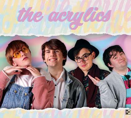
My front digipak panel:

Right-click the image and open it in a new tab for a bigger version.
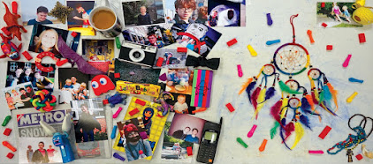
My inside digipak panels:

Right-click the image and open it in a new tab for a bigger version.
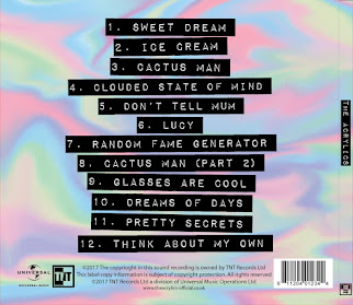
My back digipak panel (with album spine:)

Right-click the image and open it in a new tab for a bigger version.
Subscribe to:
Post Comments (Atom)


No comments:
Post a Comment