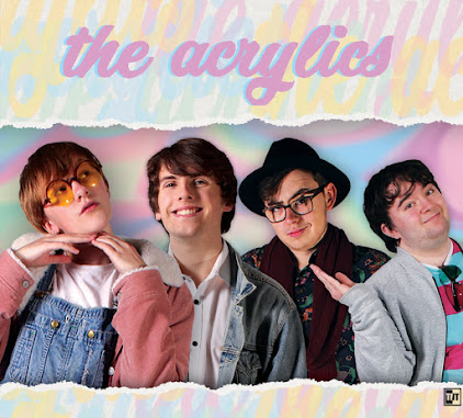
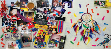
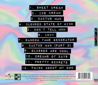
After sending out a more specific survey with our more developed ideas, we have decided that our chosen target audience is young people aged twelve to twenty-five, with a skew towards girls, with a secondary audience of anyone who is a fan of the Indie Pop genre, no matter who they are. This audiences wants artists they relate to in terms of ideals and beliefs and so on, but who are still aspirational, as they are still young and forming their opinions and making their way in the world- they want affirmation and role models. They want to see themselves represented, in age and gender and sexuality and similar, in the music world, especially if they are traditionally unrepresented. They like the genre for the fashion and atmosphere, and around a quarter of the age group listens to Indie Pop a lot, whereas another quarter listens to it occasionally, according to our survey.
A picture from a few years ago of my cousins, Elaina and Madeleine, who are part of our target audience and who took the survey. They both listen to Indie Pop and take fashion inspiration from young female artists they admire. Click to enlarge.
A graph from our survey that shows why people like Indie Pop. A lot of them like the genre itself, for the music and aesthetic, and a large part of this group also answered in the affirmative to things like mood/atmosphere, fashion/style, and relatability. Click to enlarge.
Another graph from our survey, showing reasons besides the music itself that people in our target audience like their favourite artists, many of which were Indie Pop artists. Sharing political beliefs is very important, as is fashion, regional identity, age, sexuality, and gender. Click to enlarge.
We have taken quite a few cues from certain aspects of culture when deciding on how to create our band. We noticed the popularity of "hipster" clothing- clothing designed to be outside of the mainstream yet still conventionally attractive, often through casual takes on formal clothing. The same artists who used this clothing style also use a certain pastel aesthetic, so we looked into it more, and discovered an otherwise unrelated movement that has a lot older roots but is still popular today- Bubblegum Pop. We thus looked at the Bubblegum Pop movement from the '60s and '70s, some themes of which have come back recently. One typical example of Bubblegum Pop is "Sugar Sugar" by The Archies from 1969- it is very upbeat both in terms of the music itself and the lyrics and themes, and the video going along with it also contains a lot of positive imagery and pastel colours. Even from these roots Bubblegum Pop has been associated with intertextuality, as The Archies are a virtual band made up of characters from the popular Archie comic series predating the movement. Nowadays, the pastel colour scheme and upbeat style has been mirrored once more in popular music, for example Meghan Trainor's "All About That Bass." This ever present and popular Bubblegum Pop aesthetic is something we would like to tap into, as it represents the upbeat nature we are attempting to capture, as well as the colour scheme we are looking at, and it even allows for references to popular culture.
"Sugar Sugar" by The Archies. As you can see, the video and song oozes positivity, and we would like to tap into this positivity by appropriating some of the conventions of the Bubblegum Pop movement. Click to play.
"All About That Bass" by Meghan Trainor. A modern song that follows on from the Bubblegum Pop movement of the mid-to-late 1900s, it contains much of what constitutes Bubblegum Pop but updated to fit a modern audience, in that the video uses the pastel colours and the song uses upbeat themes, but the video has been updated from the older animation style and the lyrics focus on a contemporary issue, i.e. body positivity. Click to play.
We have looked at a lot of artists that fit our criteria in order to get ideas- we are likely to create an independent pop artist, so we have been looking at bands and solo musicians that perform music in related genres and sub-genres. One such band is Echosmith. We looked to them for quite a few ideas, partially because we already know a bit about them and their music from a previous project, but mostly because they have a female lead singer and three male instrumentalists, as we are planning to, and because they are all siblings, and we are intending to have familial ties within our band also. They tend to work off of each other a lot while performing, playing off their sibling relationships in their music videos and social media, and generally have an air of lightheartedness both while performing and beyond. These are two things that we could easily incorporate into our video and social media. They are quite typical of the indie "hipster" style, with lots of pastel colours, wearing shirts, ties, dresses, jackets, skirts, and hats. However, they can sometimes be a bit more subdued in terms of colour scheme than we are planning to be, as they like to match their black and white clothing- however, matching colour schemes in itself is something we would like to do. As described in the last paragraph of this article by Phoebe Reilly, they try to avoid politics but their shared Christian faith influences their music, identity, and the overall direction of the band. We have also been looking at constructing identity and including representation through the beliefs and ideas of the band members.
Echosmith in one of their more colourful sets of outfits. Note how all of them are wearing jackets and pastel colours, as well as the presence of a hat, and the prominence of the lead singer in the front. Click to enlarge.
Another picture of Echosmith, with a similar clothing style but in a different colour scheme. The same person is wearing a hat, and the lead singer is still the most prominent, but this time all the shirts are neat and done up and one of them is wearing a tie. Artists in the genres we are looking at have quite varied fashion styles, as you can see. Click to enlarge.
Another artist we looked at was Lucy Spraggan. She is a British solo singer who progressed quite far on the singing competition TV show X-Factor, and then got signed up to a record label afterwards. She thus has had more chance than most to show off her personality and attract a fanbase, but still goes through all the regular channels to maintain this presence, such as social media and interviews. She also has quite a hipster style clothing-wise, and is quite passionate about her music and performance, once crying on X-Factor when the audience cheered for one of her original songs. Our lead singer's character has thus been inspired by her to some degree, in terms of clothing and passion for the music, as well as her aforementioned British nationality. Another way she has inspired our lead singer is through the fact that she is an openly gay woman, who is for LGBT rights and who attracts young LGBT people to her fanbase. We will likely also make our lead singer a member of the LGBT community, to further construct an identity through her sexual orientation and associated ideals, and to represent a wider part of our targeted age group as well as society at large.
Lucy Spraggan in a typical outfit. She has a warm coloured top offset by a denim jacket with the sleeves rolled up (denim jackets being quite conventional of independent pop artists,) as well as a nice watch. She has a strong sense of style despite not being "dressed up" or in formal clothing. Click to enlarge.
Once more she looks quite smart and stylish in a colourful shirt, despite wearing a bobble-hat, a rather eccentric piece of clothing, especially considering the photo is taken indoors. Once more her sleeves are rolled up and overall she looks casual and smart while not being messy or formal. Click to enlarge.
A third band that we looked at in more detail than others would be New Young Pony Club. They are an English band with quite an eccentric style, who "marry the dance ethic with the pop ethic, and make something that you can dance to and sing along to," as the lead singer once said. This style extends to their music and videos, which are quite packed with interesting sounds and graphics, as well as their actual clothing style. While they and Echosmith both use pastel colours, where Echosmith could be said to be more on the subdued end sometimes, NYPC could be said to be on the brighter end when compared to our plans- although they have still influenced our colour scheme. They are an indie pop artist, but lean more towards the indie side due to their style, while still remaining popular. This niche but popular style is something we could use to great effect with our band.
New Young Pony Club showing off their style. This is one of their more standard sets of outfits, but it nevertheless shows off their range of pastel and even non-pastel colours, and wide variety of clothing, a lot of which can be attributed to conventional indie fashion such as denim jackets, open shirts, and interesting dresses. Click to enlarge.
New Young Pony Club once more showing off a large range of colours. Bright pinks, pastel purples, both light and dark blues can all be seen here, amidst many other hues. They taught us that we have quite a wide variety of colours and clothes to choose from. Click to enlarge.
We approached the research for the third construction task in the same way as the other two- looking at a lot of influences and getting a general idea of conventions and ideas, and then focusing on a few particularly influential ones. We noticed there was almost always some kind of navigation bar, with an integrated or separate bar for social medias such as Facebook, Twitter, Instagram, Tumblr, etc. as well as ways to consume and buy the music, such as SoundCloud, iTunes, Google Play Music, etc. Certain pages such as 'tour' and 'store' were almost always present, with ones like 'contact' and 'news' and 'gallery' also appearing a lot. The sites invariably had a lot of options for interactivity, such as clicking around pages, playing videos etc. as well as many ways to give money to the band through tours, purchasing music and merchandise, and so on. A few other conventions we noticed on a few websites that we are quite interested in would be the inclusion of a charity link on sites like Modest Mouse's official site, and a welcome screen that informs of a new album that must be clicked past to get to the main site, such as on Los Campesinos' website.
The first is the website of the band Echosmith. This website is quite simplistic and conventional- the homepage is one long scroll, with a navigation bar on the top that scrolls down with you and allows you to always access the other pages on the site. We found it particularly interesting because of this feature, but also because the scrolling homepage contained every section of the website. While clicking the page names in the navigation bar does take you to a separate page, scrolling down on the homepage gives you an overview of each section of the website- this makes it easier for users to engage with the band, as they don't have to spend much time to see what they and their website's pages offer. Scrolling to the very top shows a contact bar, and the header image for the website is actually one of Echosmith's recent videos- these two things provide interactivity, synergy with the band's social media and music, as well various ways to buy. Not to mention the ever-present (until you click the 'X') pop-up that asks you to sign up to the band's newsletter. It also has a simple colour scheme that reflects the colour scheme of the band's latest album, while not getting in the way of all the links and information which provide crucial ways to interact. Overall it is a very well-designed website that presents everything quickly, effectively, and in an eye-catching way, which we could take many cues from.
Echosmith's website. Note the video taking up the top part of the website, as well as the clear navigation bar with links to other pages as well as a store. Also seen is the topmost contact bar with ways to view social media and buy music, as well as the pop-up in the corner for the newsletter, all following the same colour scheme. Click to enlarge.
Another section of Echosmith's website. Note how the navigation bar and pop-up have moved with the scroll, as well as how 'tour' and 'news' have their own sections on the main page ('music' has been scrolled by.) The colour scheme continues, inspired by the band's recent album cover. Click to enlarge.
Another website we looked at is the site of Alvvays. It is also mostly focused on a single page, with links on a navigation bar that provide ways to buy and interact upon entry of the site. The rest of the site is in blog format, showing news about the band, and it scrolls endlessly until you reach the first post from 2012. The image that greets you when you first open it is a huge stylised image with a small but very eye-catching animation around the order button- we were interested in this because the style seems similar to what we are already considering, plus it is a convention and a good idea to put such an obvious way to interact and buy in the first page of the website. Other conventions are present, such as a newsletter sign-up and tour page, with smaller versions of these things appearing on the side-bar, and social media links are given prominence in the navigation bar. Overall it is a more unique website than many we looked at, with an inspirational visual style, but it still follows quite a lot of conventions.
The first page of Alvvays' website. The navigation bar is quite small, but still eye-catching, because the black-and-white colours make it very easy to read and contrast with the rest of the website. Thus the eye is drawn to both the interesting image that references the band's new album and has an opportunity to buy, but also to the bar with even more ways to interact through social media and buy through the 'store' and 'tour' pages. Click to enlarge.
The beginning of the rest of the site. It is in blog format, and the navigation bar doesn't follow, but the newsletter sign-up and tour dates are present in the sidebar, and the blog itself serves to promote the band further as it is effectively a news feed telling of said tours as well as album releases and such. Click to enlarge.
Chvrches' website is another one we looked at. It is another one that is focused on a single page that contains everything, with a few other pages, rather than a traditional website with a homepage and then separate pages for each section. It opens on a pop-up informing people of the new album, showing its album art, and providing various different platforms to buy it on (with one option including a t-shirt.) Pop-ups seem to be a convention that is used to engage viewers and try to entice them to buy. Past the pop-up, the website has a very strong visual style, mimicking the front of the aforementioned new album. A grey box on the side opens up what would the navigation bar on other sites, and a pink box under it opens a contact bar, that contains many social media platforms to interact with as well as yet another chance to go to one of the various online stores and buy Chvrches' music.
The opening screen of Chvrches' website, showing the pop-up. It gives a brief overview of the album as well as many ways to purchase it, and serves a similar purpose to the welcome screens we saw on other sites. Click to enlarge.
The main page of the website with the sidebar open. As you can see all the social media and buying options are presented when you click the pink box, in a dark black to stand out against the plain pink, providing interactivity, synergy, and ways to buy.
Like with our music video research, we looked at a lot of different album covers, that all influenced us in some way. However, we did end up focusing on a few albums that were especially useful for informing our ideas. We noted the presence of the artist on the front of many of the albums, as well as the relative plainness of the inside and back so that important information isn't lost amongst clutter. One of these is the album Fantastic Playroom by New Young Pony Club. It is bold and simple, with a plain white background, pink title, and line-up of the band members. It serves to showcase the band, as it is their debut album, but also has a striking style that draws the eye. The back of the album carries on this style, with a pink background and white text, flipping the colours but keeping the same scheme. It conveys all the information it needs to- practical things like the album and band names on the front, song names and legal information on the back, but also things that should draw the target audience to the band, such as showcasing a small part of the band's personality by showing each member performing a gesture.
Fantastic Playroom by New Young Pony Club- the front and back of the album. You can see the strong colour scheme carried on throughout the album cover, as well as how simplistic yet readable the whole thing is. It makes an impact but also conveys all the information it needs to. Click to enlarge.
Another one would be California Nights by Best Coast. We noticed it was very typical of album covers of its genre, which would be indie pop, a genre we are heavily considering as our song's genre- for example, it has a border that is just a flipped part of the image, a feature we saw on many albums, most notably Talking Dreams by Echosmith, another top inspiration. It has the band members on the front, as many albums do, and clearly states the name of the album, while also clearly stating all the songs on the back. The colour scheme is continued throughout- either the background image is used repeatedly, or the gradient from the background image is used instead. The inner sleeve has lyrics to the songs, as well as a lot of pictures of the band and various other things, which all have the same atmosphere and a similar visual style to the album itself. While we are potentially looking at doing a lighter colour scheme, this album is otherwise very influential.
California Nights by Best Coast- the front and back of the album (the top left and bottom right images) as well as portions of the inner sleeve. As you can see, despite the changing colours throughout, the same gradient is used, and elements of the same image is repeated. The band is shown on the front, and further expanded on personality-wise through the pictures inside. Click to enlarge.
A third album cover we looked into is Sistrionix by Deap Vally. It has a very strong sense of style, with contrasting colours dominating the otherwise plain colour image, but still has a lot of detail in the painting despite the simplicity of the colour scheme. The album title and band name are given extra prominence by positioning them in the centre focal point. The back of the album is more stylised than some of the others we have looked at- there is a photograph of the painting used on the front, and some smaller stylised text below to inform the viewer of the song names. It has all the necessary information, but is more focused on form than function. Overall it was quite a different album cover than others we had looked at, and its relative uniqueness should help us when it comes to designing our cover.
Sistrionix by Deap Vally. The front image is very simple in terms of colour, with the yellow and red hair dominating while the rest of the picture makes do with a pale pink and grey scheme. The back of the album goes even further, by making the surroundings of the painting greyscale. Click to enlarge.
We looked at quite a few music videos to inform and inspire our own ideas. We tried to stay within the genres we were considering at that time- mostly the indie and pop genres and subgenres. While we took inspiration from all of the videos we looked at that fitted our criteria, a few in particular stood out. The first one we felt particularly inspired by was "You've Changed" by Sia. It has a very interesting visual style, full of mise-en-scene like DIY props and eccentric costumes in order to create this style. The whole video is presented as a video game featuring various young people as the playable characters- the on-screen graphics are simply cardboard pieces held up physically by people's hands, which are sometimes shown in shot. The colour scheme also work towards this simple, playful style, as it is simple and pastel coloured, and the various gestures by Sia and the actors also convey this. The video also swaps between performance and narrative with a bit of crossover- some shots show Sia singing, and some show the characters in the game, but they all share the aesthetic as if they are all part of the same game.We decided we could incorporate the use of young people, i.e. people from our target audience, into our video, as well as the idea of referencing pieces of media such as video games. We also assimilated the pastel-coloured, DIY aesthetic of the video into our overall video ideas- besides the fact that we can easily create props and costume that looks like this ourselves, it also provides a fairly unique visual style, that we can tweak and put our own spin on.
"You've Changed" by Sia. A very unique music video, which doesn't really move the camera around or change shot types (as is conventional, and as we are planning to do,) but that still manages to provide a varied experience through its constant switching of cardboard background and foreground elements. We really like its style. Click to play.
Another video quite instrumental to our ideas is that of the song "Ghengis Khan" by Miike Snow. It has references to popular culture and pieces of media like the Sia song- in fact, the whole video is a parody of spy movies in general, and James Bond movies in particular. We really liked the direction it took- once more, performance and narrative are mixed, with the characters who are acting out the narrative also singing as performers. The contrast between normal home life and the James Bond-esque over-the-top villain's lair was also quite interesting, as was the constant movement between extreme long shots and close-ups and everything in between. Filters have been used to make the video look like an older movie, and there is a strong colour scheme of bold colours like the red laser against plainer colours like the grey stone. The romance theme is also interesting to us, as we are leaning towards the idea of having a love-based storyline- the lyrics reflect the actions of the characters as well as the storyline, as the villain is torn between acting out his role or giving in to his feelings and admitting he wants the secret agent to be with "nobody else but [him.]" Finally, the video ends on a small outro scene without music or singing, which is an idea we were already toying with.
"Ghengis Khan" by Miike Snow. Elements of post-modernism are found throughout, with the references to pieces of media such as classic James Bond films, as well as the positive portrayal of a homosexual relationship, which you would be unlikely to find in said older movies. Click to play.
The third and final video we decided to research in more depth is "When I'm With You" by Best Coast. Another video that deals with love through exploration of a popular culture icon, "When I'm With You" depicts a relationship between the singer of Best Coast and a slightly edited version of Ronald McDonald, the clown mascot of large fast food chain McDonald's. Once more there is a strong visual effect on the video, achieved in this case through warm lighting and filters. The camera jumps between a variety of shots, as well as quite a lot of movements, and the camera follows the characters through the events of the video. The intertextuality of Ronald McDonald appearing in this video was very interesting, especially as he has been put in the real world in a normal relationship with a person not originating from a piece of media. Aside from love, another big theme of the video is "remembering good times," which works quite well in tandem with love, so we may well end up using this theme too.
"When I'm With You" by Best Coast. An inspirational video from one of our top inspirational bands, which contains a lot of the themes and camera shots, movements, etc. that we are considering using. Click to play.
We are looking at a wide variety of songs for our music video. Our biggest limiting factor is that the song should be under 3 minutes, although we can cut down songs that are slightly longer. Here are 5 of our best options. The first is Scott Bradlee and Postmodern Jukebox's cover of "Umbrella" by Rihanna, sung by Casey Abrams. Postmodern Jukebox is a music collective started by Scott Bradlee, where he gets various different singers and instrumentalists and so on, and arranges various songs (mostly pop) into older music genres and styles, such as jazz and swing, for them to perform. It would be a great one to do, because it is upbeat and interesting, has a link to pop music but also more niche genres such as jazz, has no true music video (just a video of the band performing,) and is just under 3 minutes long. We could do a lot of interesting things with the meld of old and new that the song presents, as well as the relationship themes the lyrics convey. The downsides would be that it would be a bit tricky to get all the instruments required for the performance, plus we'd have to be very careful with our appeal to the audience since we don't want to alienate anyone while we aim both at the mainstream pop genre AND the more niche jazz genre and their fans.
"Umbrella" by Postmodern Jukebox. The video is longer than 3 minutes because Scott Bradlee gives an update on the collective's future at the 02:59 mark, which is where the song ends, so you may want to pause the video at this point. It is a very interesting blend of an older musical style with a newer and well-known song, and so we have a lot of scope to craft an interesting music video to go with it. Click to play.
The second is "Istanbul" by They Might Be Giants. They Might Be Giants has a huge discography, but this is one of their shorter songs, that still has a lot of energy and character. The song is themed around the city of Istanbul and how it used to be called Constantinople, and the history of the city. This gives us some clear themes and ideas for a music video, that could be history themed. The short running time might also be a disadvantage, however, as we have less time in which to craft a good video, and thus we might have to drop some ideas and the music video's quality could be compromised if we weren't careful- plus we'd have to be careful to be respectful of the culture of the city and country if we decided to go more that route rather than the historical route.
"Istanbul" by They Might Be Giants. It's only about 2 and a half minutes long, and has a fairly long instrumental intro. We could use the extra time, plus the instrumental time, to create some narrative for our video, but we'd have to be careful not to step outside the bounds of what can be considered a music video, as opposed to a short film with music. Click to play.
"Everywhere" by Ex Hex is the next option. It is slightly longer than 3 minutes at 03:18, so we would have to take that into account and cut it down somehow, but the lyrics are full of imagery and thus have a lot of scope for experimentation and an interesting music video. It has a long instrumental part which we could cut down, and use for even more experimentation. It is a catchy song with simple enough instrumentation, and all of these things combine for it to effectively be a blank canvas for all of our ideas. However, this strength could also be a weakness, as it may be harder to find meaning in the lyrics than in other songs, and we could lack a driving force in the music video that other songs with simpler/clearer messages and themes could provide.
"Everywhere" by Ex Hex. It would be quite a good choice for this project as we could tailor it to our audience very specifically, due to the freedom we have with making a music video out of it. We could adhere to the conventions of music videos and use as much theory as possible because it allows for that by being so abstract yet simple and catchy. Click to play.
The next one is "Sweet Dream" by Black Cat Zoot. This is another song with an interesting set of lyrics that we could adapt into whatever we want, and it is below the limit of 3 minutes too. It is very unknown and indie, and firmly part of the indie pop genre, which gives us an audience to target. It's catchy but also a little bit soft and dreamy, hence the name, which we could use when creating the video- possibly using filters or visual effects or some other kind of imagery to add a dreamlike quality to whatever we decide the video is going to be. It does come with its own set of challenges like any other song, however, such as the fact that it sounds like it might have some non-standard instruments in the backing, but luckily for us the main instruments are still easy things like guitar and drums, and a keyboard should cover the rest.
"Sweet Dream" by Black Cat Zoot. This would also be quite a good choice for this project, as it is catchy yet interesting sounding, with very imaginative and metaphorical lyrics that could be interpreted in many ways to allow for a wide variety of music video ideas. The timing is perfect as it is almost exactly 3 minutes. Click to play.
The final choice on this shortlist is "Halo" by Cage the Elephant. My groupmate Noa suggested it before she knew I liked the song (and band) too, and I think this shared appreciation of the song on a personal level could help us when crafting a music video for it, especially since Jack also really liked it when we played it for him. It is a bit more unorthodox musically than some of the other songs here, which means we are limited somewhat, but we could use its uniqueness to drive the music video if we so wished. It is under 3 minutes at about 02:57, and has a good standard structure of verses and choruses with instrumental breaks, that we could use to form a good structure of a music video.
"Halo" by Cage the Elephant. Noa and I will try to put our like for the song aside somewhat as part of the decision making process- another song might be better in every way, and we don't want to let our appreciation for this song get in the way of that, although later on in planning and construction it could be a boon. Click to play.