Similar to the process we followed with the website, once we had built up a large set of influential album covers through research, we could move onto planning our own. We set to work with knowledge of relevant conventions, as well as what we wanted the album to look like in order to comply with the overall aesthetic of the band, while having synergy with the music video and website. We created a final flatplan to represent the consolidation of our ideas into one document.
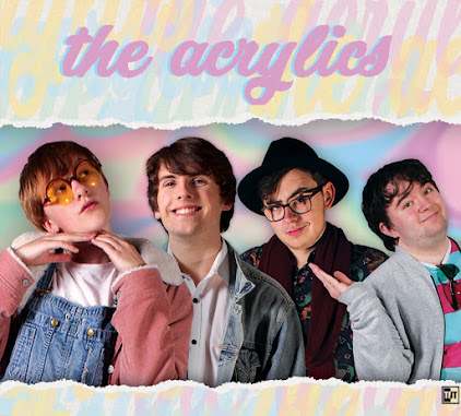
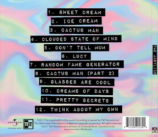
The front and back panels of our flatplan. We have included genre conventions such as the border, as well as important but more general conventions such as having the band's name on the front and the song names on the back. We gave it a bit of unique flair to represent our band's personalities by having a line-up of the band (conventional for debut albums as people seeing the album and thus band for the first time must be able to gain some information about them,) but making the sizes of the people in the line-up go down in descending order, but not to too small a size, as the smallest person must still be visible on a CD-size case.
The front of Echosmith's album "Talking Dreams." We really liked this one- it has the conventional border, the band and album names large and obvious, and a very clear colour scheme to introduce the band. We sketched our flatplan and thus it is in black and white, but we specifically annotated that we were going to have a lot of colour, in part due to the influence of this album, as well as due to audience input, in which audience members stated they wanted to see lots of colour that lined up with the band's aesthetic. Click to enlarge.
The front and back of New Young Pony Club's "Fantastic Playroom." This is their debut album, and thus as is conventional the band appears on the front. They are very clear and easy to make out, due in part to the plain background, but this doesn't impact the overall design on the album- in fact, it compliments it, as it benefits its strong white and red/pink colour scheme that extends from the front onto the back. The text is also clear and easy to read, so you can see the conventional and important information such as the band, album, and song names. Click to enlarge.
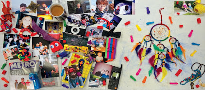
The inside panels of our album. We drew in the CD's location in order to design around it. We wanted more personality to be available in these sections, to further inform and draw in people who liked the cover enough to open the album. Thus we settled on a picture of a table, to provide a nice background, with a lot of things relevant to our band sitting on top- this includes relevant music equipment such as a guitar pick, microphone, and drumsticks, as well as pictures of the band and its members. We noticed things like this on a fair number of albums we researched, and furthermore, many audience members mentioned to us that they quite liked the idea as they didn't see it as often as plain inside spreads. Click to enlarge.
All panels of "California Nights" by Best Coast. This was also a very influential album- it has the border and image of the band on the front, as well as clear and readable text showing the album, band, and song names. Inside, there are a lot of pictures of the band, to further show off their personality and get people invested in them, especially since people who have opened the album to look at the inside are already somewhat interested due to the front of the album. Click to enlarge.
After looking at all the conventions of websites in our genre of indie pop, we moved on to designing our own. We used our knowledge of the general structure of such sites, as well as the smaller yet essential things that also contribute, in order to construct an eye-catching website plan that shows off our band and their aesthetic, helping sell them to the audience, while still adhering to convention. One key convention that really guided our flat plan is that a lot of websites, of the kind we are looking at and trying to fit in with, present everything on one page, with each section available by scrolling and the navigation bar following you down and providing a quick way to jump to each section.
Our final website flat plan, that consolidates all our individual ideas into one, as well as showing off the conventions that we all included in our individual flat plans. Click to enlarge.
We have a header image of the band, to instantly show viewers who we are, and hopefully give an idea of our aesthetic and music if the promotional shots we take are good. A navigation bar setting out everything a visitor could need in a clear way is present above, and it will follow when the page is scrolled down, providing a constant opportunity for interaction through the social media links and thus encouraging people to get immersed in the site and thus the band. This will make them more likely to like us, and thus more likely to buy our music and/or merchandise. To this ends, buttons that link to our music on iTunes, Spotify etc., to our store, or even to our tour tickets are frequent and obvious, providing ways to interact in and of themselves, while remaining ways to buy. We may also have a pop-up that appears when you first enter the site, informing people of our new album and music video, and how they can buy it. The video itself is also near the top of the page so that people can interact by clicking it, and then experience a three minute long showcase of our band's music, personalities, aesthetic and more to draw the audience in. The entire website will have a colour scheme and general aesthetic that matches our band and their video, and this synergy continues into the social media pages, which are also ways to advertise things like band merchandise and music. We each did a flatplan before the final version. We each focused on different aspects despite sharing certain key conventions, such as the navigation bar, and these aspects guided the final version. Noa really focused on the infinite scroll, being particularly inspired by the website of Alvvays. We decided it was a good idea because it was conventional, but also because it provides everything the audience could want on one page, including information on the band as well as ways to buy. However, multiple audience members told us they thought the main column of the website was too small, with the art on either side taking up too much space, and so we changed this in the final version by widening the main column and fitting more in.
Noa's flatplan. As you can see, she has left a long thin space for the majority of the website, while still adhering to the conventions of having a navigation bar and set of images at the top, as well as an obvious 'buy' button. Click to enlarge.
Part of the infinitely scrolling blog of Alvvays' website. You can see the clear influence on Noa, with a fairly thin strip for infinitely scrolling information surrounded by a pleasing design that matches the band's aesthetic. Click to enlarge.
I focused on delivering as much information as possible as quickly as possible, to capture the attention of audience members who visit the website. I noticed this was conventional, with large headers on websites like that of Echosmith, that show off a music video or set of images or both. We ended up including a fairly dense block on information at the top of the website on our final flatplan- the audience wanted a title at the very top too, though, to introduce the website before this block of information. Thus this was added to the final design.
Part of my flatplan. This segment shows my idea for a navigation bar with a lot of different options, including all the standard opportunities to buy such as 'tour' and 'shop,' and extra ways to interact and get acquainted with the band like 'win' and 'about' respectively. The 'win' section is conventional, but slightly less common than, say, the 'music' button, but it made it from my flatplan onto the final version.
The top of Echosmith's website, which provides a lot of information at once, and which was one of my favourite inspirations. The header image is also the thumbnail for the band's most recent music video, and the navigation bar is clear and easy to read, with the band name as well as all the relevant buttons. The colour scheme is instantly clear. Click to enlarge.
Jack liked the idea of having a set of images that people could click through as the header of the website. This provided a way for the audience to get a quick idea of what our band is like, while also allowing for some interactivity. He then placed the music video under this, so that people who have been drawn in enough at this point can scroll down and see a whole new section of the site with a video for them to watch, rather than wasting our 'ace in the hole' right away. This idea made it into the final flatplan, and Jack was inspired by Sheppard's website.
The relevant section of Jack's flatplan, showing the image box and arrow keys to go through all the images, and then the video right underneath rather than being part of it. Click to enlarge.
Sheppard's website. The navigation bar is at the top, and then their is a long picture showing a promotional picture of the band and then some tour information as you scroll down. Then when you finish scrolling through the image, you reach a set of two videos to further interact with. Click to enlarge.
We decided we needed two sets of promo shots- one lot in the studio, for the album cover as well as the website, and one on location, mostly for the website and associated social media. We wanted a good mix of professional-looking studio pictures and down-to-earth pictures outside of the studio, so that we can show off both our band's attitude towards music and their individual personalities outside of work. We decided to look at the various promo shots of some of the influential bands we researched in order to get ideas for our own promo shots. We noticed certain kinds of promo picture coming up time and time again, and decided we could use these conventional shots to our advantage. We didn't do a lot of flat plans for individual shots, because we wanted a naturalistic indie style even in our studio shots, but to compensate for this we kept these images with us, as well as all our other influential images that we found through research, in order to reference them and imitate them wherever fitting.
An intimate shot of Alvvays. They band members are touching and leaning on each other, and this really helps to show off their closeness, personalities, and relationships, and show off the real people behind the band, despite the sterile studio setting. Click to enlarge.
A similar shot of the band McFly. Once again it is in a studio, but each individual band member's personality is shown off through their poses and facial expressions, and you get a sense of the good relationship between them through their close proximity and the fact that they are leaning on each other. Click to enlarge.
Some artists also have other kinds of shots to show off specific relationships. This is a promo shot of Best Coast, a duo rather than a full band, and thus they are more close than the average band. You get a strong sense of each person's personality and their specific link, with the singer laughing and pointing to the guitarist. Shots like this would be especially good for illustrating the relationship between Casey and her brother Hugh. Click to enlarge.
A shot of Kings of Convenience in a similar vein to the Best Coast one above. Here, the hand resting on the shoulder and the 'slice of life' look of the promo shot (and it is still clearly a promo shot, as seen through the eye contact with the camera,) as if the camera was interrupting a conversation, really cements the good relationship between these two specific people. Click to enlarge.
A promotional shot of The Smiths. Sometimes a little bit of messing around can really endear people to the artist- unlike dramatic poses in a studio, a more human connection can be made by seeing people in real places and situations, playing around like any person would with their friends, or in this case, bandmates. Click to enlarge.
A shot of Alvvays outside the studio. Here all the band members are messing around together, lifting up the singer and either acting humourously deadpan or smiling at the situation. This makes for an entertaining shot that people will like seeing, and thus they will end up liking the band too. Click to enlarge.
Echosmith sitting in a line. While it is taken outside of a studio, the bench forces them to be in order and gives off the sense of a professional shot of the whole band together (rather than a candid one,) but the location still gives off a feeling of authenticity. Click to enlarge.
Sheppard sitting in a line. Each band member is clearly visible and the shot is quite clean and ordered, as opposed to the messing around and candid shots that sometimes happen outside of the studio, but their personalities can still be gleaned somewhat from their clothing, body language, etc. Click to enlarge.
Following on from the timeline, we decided to create a storyboard. Whereas the timeline was the first version of our ideas consolidated onto one sheet, with a focus on the overall structure of the video with as much detail as we could fit, the storyboard had more of a focus on the shots themselves. The timeline described each shot briefly with text- the storyboard has actual images of each shot, with the framing, composition, and other useful and/or essential information available at a glance. To allow for this level of detail and aid in our organisation, we ended up dividing the storyboard into sections across two A3 sheets instead of just one as with the timeline, but this hasn't negatively impacted us too much as each sheet is laid out simply and both sheets are stored together; the pros outweigh the cons.
The first page of our storyboard. As with the timeline, I will provide closer photos where relevant, but this overview should serve to show that we have organised the sheets into sections to aid readability, while including all the shots individually with a key to help in getting information at a glance. Click to enlarge.
The second page of the storyboard. The second set of sections were spread out equally like the first, aiding our organisational efforts. The sticky notes themselves are easy to read, and having them separated into sections is good for preserving this readability. Click to enlarge.
We divided the storyboard into set-ups. We knew we would have a lot of different kinds of shots of the band, so we gave the band a set-up, and we knew we would have a narrative section for each of the four pieces of classic media we incorporated into the video, as well as a section for the lead singer falling asleep and waking up in her home, so we gave each of those a set-up too. In this way we could see every single shot, camera position, etc. we would need for each section (as each set-up will take place in a different location within the video, and thus each will have their own set, lighting, mise-en-scene etc.) as well as which sections will take us longer to film as they have more shots. The shots themselves have fairly detailed drawings of what is taking place, showing the framing and composition as well as the actors and props needed to some extent. The colour of the sticky notes corresponds to a key, which further aids how much information can be gleaned from one look at a shot.
An example of one of the sections on the storyboard- this one is for the "Mortal Kombat" video game set-up. You can see all of the different shot types and framings we will need, as well as the costume of certain characters, and even the 'fight sign' prop. Text descriptions aid understanding of what is happening in each shot- one even has an editing note as that shot will probably take place in slow motion. Click to enlarge.
The storyboard key- yet another tool for gaining information quickly, easily, and efficiently from the storyboard, which is what it is designed for. Click to enlarge.
We produced a timeline in order to lay out solid, concise ideas for the music video's structure, shots, and so on, rather than leaving everything split up across all the research and planning documents we had created so far. Having everything all on one large piece of paper, with shots laid out in chronological order with text descriptions and accurate times to match up with the song, was a really big help in organising our thoughts and finalising our planning.
A picture of our entire timeline. I will provide closer pictures when talking about relevant sections, but hopefully this overview still allows you to see how we managed to pack as much concise and useful detail on the final plans for our music video onto one sheet, that we can reference whenever we need it. This includes shots with shot types and text descriptions, some lyrics, accurate timings, and more. Click to enlarge.
Our planned structure is to work around the lyrics- we broke the timeline up into verses and choruses, and we timed the lengths of certain sections, particularly the narrative sections, around the lyrics we were interpreting. We even allocated the time for the outro scene that takes place once the song itself has ended.
An example of part of our timeline- this is the end section. You can see where we have marked off the choruses along the line, and drawn in the details for the shots around it. You can also see the outro right at the end, as well as the large party scene that takes place just before it. Click to enlarge.
Overall the timeline was a very useful document to create. We achieved our aim of consolidating and finalising our ideas onto one sheet, and we created the first detailed structure for our video- we can even look at the timeline while editing the footage to guide us.
We decided to create a visual representation of our music video to go along with all the ideas and interpretations we had planned so far. We realised that pictures and flat plans wouldn't be enough, and that to represent a full video, we needed another, preliminary video. This was the steal-o-matic, in which we took clips from various sources, mostly influential music videos and the pieces of classic media we were working into the narrative through interpretation of the lyrics, and then edited them together as if they were actual footage from a shoot into a rough visual representation of our plans. We were able to use clips from lots of our influential artists, as well as movie and even video game clips, all to build a real, viewable representation of what had previously just been research, ideas, and plans.
Our steal-o-matic. It is only a minute long as it is simply a preliminary test for what our video could be, not a full prototype for the final version. It contains clips from many sources, each relevant in different ways- they might have a shot type we like, they might have a colour scheme we wanted, etc. We edited them in the same way we are planning to edit the real thing. Click to play.
One way it helped us was laying out our ideas for where lyrics, music, and video/editing all interact. Right at the beginning, for example, there is an instrumental section, with some guitar chords interrupted by brief solos on the piano and guitar and so on- when the drum solo kicks in, so does the first verse. We decided to have our lead singer asleep on the sofa for this instrumental part, to set up the dream part of the lyrics and narrative. The musical interruptions would also be edited to interrupt the narrative with close shots of the instruments that were interrupting, and then when the first verse starts and the music really starts to pick up, suddenly we switch to a long and wide shot of the band with the lead singer now performing with the band(something we had picked up from Vernallis' ideas of breaking continuity editing and going from close to long and vice versa to make the video dynamic.) We found some really nice shots from some of our influential music videos that contained the framing, colour scheme, and actions that we needed to construct this section, and thus we edited them together into our steal-o-matic, and were all able to see how these ideas actually worked visually in a video.
The opening section of our Steal-o-matic. The sleeping is from "Feeling OK" by Best Coast, the keyboard is from "Montreal" by Roosevelt, the guitar is from "Crazy For You" by Best Coast, as is the handheld close-up from the next interruption, and the shot of the whole band is from "Geronimo" by Sheppard. Click to enlarge.
The steal-o-matic also allowed us to refined our performance segments, even in terms of set design and camera as well as the performance itself. For example, we have used Sheppard's "Geronimo" quite a lot- this is because, although we are not planning on having a large set with lots of props scattered around as they have, we are planning on having energetic long-shots of the whole band in a studio setting. Plus, the colour scheme of having bright pastel colours (in the form of the many props in the Sheppard video, and likely lighting and some props in ours) on top of a plain, more neutral background (in the Sheppard video, this is the grey room, but we will likely just have a blank studio cyclorama to experiment with) is something we have been working on for a long time.
A clip from Sheppard's music video for their song "Geronimo." We have used parts of this in our steal-o-matic, as the varying shot types, including the extreme long shots of the band in a studio setting, as well as the camera movements, are quite useful to us in visualising what our video might look like in terms of camera. Additionally, although they have more props to build mise-en-scene, this video has a similar colour scheme to what we are planning and has been an aid in planning set design for our video. Click to enlarge.
Narrative is also something we refined through our steal-o-matic. As we wanted to use references to various pieces of media in our video by recreating them in a style that fit our artist and aesthetic, we took this opportunity to edit in clips from films like "Singing in the Rain" and even video games like "Mortal Kombat," scenes from which we were going to reproduce as part of the narrative's storyline, in which the lead singer has dreams of interacting physically with characters from these pieces of media. This allowed us to see how these more unorthodox video clips would fit in with the rest of the music video- and in the end, we decided that (even without being able to recreate them in our own aesthetic and just using raw footage from the source media) they fit quite well. We could have a small dance scene like the famous segment from "Singing in the Rain," we could use a profile long-shot to mimic a match from a fighting game like "Mortal Kombat," and then edit them along with all the performance clips when it came to making our final video.
One of the most famous scenes from the film "Singing in the Rain," which we are planning to recreate in our music video. Dance scenes are not uncommon in music videos- we just have to re-choreograph this particular dance to be suitable for our video, while melding its darker colour scheme and set with our own colour scheme and mise-en-scene (possibly by making the orange light of the lamppost more pastel and simplifying the background.) Seeing these clips in the steal-o-matic made these developments possible. Click to enlarge.
One of the first things we did after finalising our track choice was create a rough lyrics sheet for the song (as we could not find a good one online) and then use this sheet to make notes on our own analyses of the track. To start, we simply went through all the lyrics and wrote down things that occurred to us. As we went through, we noticed the general themes of nostalgia and closeness with somebody, as well as quite a few lines which we decided to interpret as references to various pieces of old but well-loved media in keeping with these themes. These include the lines "the morning I was dancing in the rain" which we linked to the movie 'Singing in the Rain," and "Lucy in the sky, smiling down" which we linked to the Beatle's album 'Sgt. Pepper's Lonely Hearts Club Band' which contains the song 'Lucy in the Sky with Diamonds.' Lines like "you took my hand" and "together forever," as well as the chorus "don't wake me up, I'm having a sweet dream, about you and me and a slot machine," all point towards the love side of the song's themes. We will try to visually interpret these lines and themes in the video by having the lead singer exploring a nostalgic dream in which she meets the characters from these pieces of media, while mourning a lost love and looking for another. Analysing the track like this was beneficial as it really helped us cement the ideas floating around in our heads just from listening to the song and unknowingly absorbing the themes and atmosphere without thinking about any of the song's ideas in detail.
One page from one of our sets of lyrics notes. This page shows quite a lot of our ideas, some of which we will likely carry forward and some of which we won't. Getting them out on paper really helped us weed out the bad ideas and identify the good. Note in particular where we have picked out certain lines are references to certain pieces of media, in an almost post-modern way in that the video will contain intertextual references to them. Click to enlarge.
We also looked at how the lyrics and music interacted as part of this process. This helped us to build a basic structure for the video, that rises and falls and climaxes and so on along with the music and even the ideas present in the lyrics. One good example of this kind of analysis and planning comes near the end of the song- the music really picks up at every chorus, and we made sure to include exciting bits of narrative and performance through our interpretation of the lyrics in these sections. At the end of the song, there is quite a soft and less dynamic section relative to the rest of the song, where the singer repeats "together forever" for a while. After this, the chorus kicks back in for the song's climax- we thus decided to put a large party scene here, one that thrusts the characters from the narrative and performance sections together, along with a mish-mash of other characters from popular media, in an energetic representation of the music. Analysing the song musically as well as lyrically was a big help, as it guided our interpretation of the song as a whole- simply looking at the end chorus without music doesn't present much interest, as lyrically it is identical to the other choruses. Musically, however, there is a slow build-up and huge finale which we were able to work into our plans.
Another extract from one of our song analysis sheets. As you can see, the slower "together forever" section has been marked off, and the following chorus has been assigned a party scene. The lyrical structure of the song and the musical structure of the song work together to provide many opportunities for interesting interpretation. Click to enlarge.
Another key way we analysed the song is through use of theory. We looked to the work of Carol Vernallis- she says that the music video is a visual response to the music itself. We were already on the right track, in that we were looking at the music and lyrics and figuring out how to interpret and represent them visually. We looked further into her ideas, and have decided to try and have the editing and camera work with the music to further this link between the music and its video- for example, when the chorus kicks in, there might be a cut to a much wider or closer shot, to have a large visual impact to go alongside the musical impact. The ideas of Railton and Watson helped us during the phase where we were considering the structure, camera, and editing of the video, in that we know we must tell an overall story with our video's narrative alongside the necessary editing and interpretation of specific lines- things outside of editing and camera, such as mise-en-scene, can aid in visual narration. We also looked at the encoding and decoding model of Stuart Hall, which states that meaning in music and music videos is polysemic- i.e. different people will see different signs and interpret the video differently. Thus, when dealing with our song's themes, we had to be aware of what our dominant reading is and try to guide people towards it, while no alienating people who interpret the video differently. The story of our video is that the lead singer has suffered a bad break up, and after going through a dream of her past, she goes on to find a new love. We have tried to convey the idea that you need to move forwards past your memories in order to discover new things, but in Hall's model we have also allowed for the negotiated reading (indulge in the past but don't let it block you from experiencing the future) and even the oppositional reading (living in the past is a good idea sometimes and can help you feel better about present and future problems.) All of this should add extra depth to our video.
A brief overview of some of the different readings we realised people could have of our video- they all go over the same narrative, themes, and certain specific lyrical interpretations, yet they all offer slightly different views on the video as a whole. We don't want any interpretation to feel wrong, and we want our video to have some depth for the audience to explore. Click to enlarge.