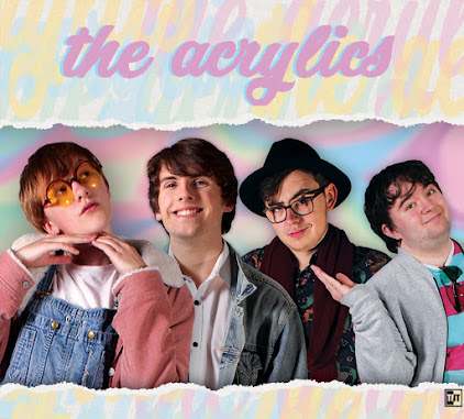
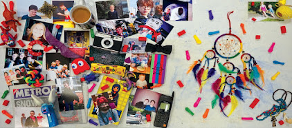
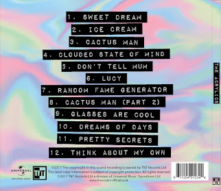
The third and final product of the construction phase would be the website. Jack was leading this project- as with the other stages, the leader did the majority of the basic work with lots of input from the other two group members, who also helped out. In this case me and Noa were the helpers, and we helped not only by doing some website editing, but also by creating various elements for the website, especially in the final week when we had both mostly finished off our products and Jack needed an extra boost from us. The website was built using Wix, an online website creation software with the ability to edit your website and then publish it live, with Photoshop used to create various images to be used to actually build the site within the browser. Website editing consisted of creating various pages and website elements, and linking them all together. We have a pop-up, a home-page, and a few supplementary pages that can be accessed from the relevant sections of the main page- for example, clicking the competition image takes the viewer to the special competition page. The home page is built of lots of small sections, including one for the debut video, one for the album, one for the gallery, one for the merchandise shop, and so on.
Our Challenges
A few problems came up during this stage. The main one was the sheer number of images needed on top of the actual framework of the website- the video, for example, had all the footage already available, and the digipak required image editing but also had the basic template already in place. Thus we had to manage time well to have enough for all three projects, with Jack trying to stay ahead to save us time (which he did well) and Noa and I trying to not neglect our own products while aiding Jack (which we managed to do.) Breaking up the work over the multiple weeks we had, and Jack assigning us things to make for him so he could focus on other stuff and know he would have access to another image later on without having to work on it himself or worry, both really helped us overcome this challenge and get all three products done in time.
Another thing we had to contend with was the way Wix works. Sometimes, we had a plan for something, often something quite conventional, but Wix didn't have a one-step tool for it. For example, if we wanted an image to change when the mouse cursor touched it, yet still be a link to somewhere else, we couldn't just use the button tool- we had to make an invisible link box over an image box. Wix is a great website and piece of software, but it came with a learning curve, especially since we hadn't used it in any other projects throughout the years, although we overcame each issue as they came and still managed to have everything the way we originally envisioned it, and we were all quite proficient by the end.
My Contributions
My contributions included making four or five of the merchandise images, making some of the general website pictures, coming up with the idea for a coloured outline to appear around each band member when selected with the cursor, suggesting we move each section of the home page apart more to aid in reading them as separate things, finalising the details of the contest, general work and aiding in decisions and design, and more.
Feedback and Changes
We changed the website quite a lot as we progressed, basing the changes on our own adaptations as well as audience feedback, as with the other products. One thing we changed was the obviousness of the contest- an audience member mentioned they wanted to know about it soon after reaching the website instead of having to work more to find it, so we added a link to the contest page to the image gallery at the top of the main page. This solved the problem straight away and ensures people will be more likely to get drawn in quicker.
Another thing we changed was the start screen. We hadn't decided if we were going to have a start screen or a pop-up when we made a flat-plan, as we considered them interchangeable. However, both our target audience and our teachers seemed to agree that a pop-up that doesn't require a change of page is a much better option. Thus, after finding out about this, we added the pop-up.
A third change would be the separation of the 'about' and 'gallery' sections. We originally had them be the same thing- clicking the information box about a band member would open their gallery. However, we found some of our audience who we had try out the website missed this too easily, and thus we added a dedicated gallery lower down the page, with a link to it on the navbar, but still left in the links in the 'about' section. Thus, people who want to click the information boxes to see more are accommodated, but people who don't realise that is an option but still want to see images have a clearly signposted gallery to visit.
Our Progress
Overall I think the website was a success. While it ended up taking us the longest out of all three, and we could probably have learned a bit more of Wix on the weekends before the product construction weeks, we still managed to produce a website very much in line with our original ideas, that looks good and is very functional. We used Wix to its fullest extent and produced something we are all proud of.
~~~~~~~~~~~~~~~~~~~~~~~~~~~~~~~~~~~~~~~~~~~~~~~~~~~~~~~~~~~~~~~~~~~~~~~~~~~~~~~~~~~~~~~~~~~~~~~~~~~
My finished music video:
My front digipak panel:

Right-click the image and open it in a new tab for a bigger version.
My inside digipak panels:

Right-click the image and open it in a new tab for a bigger version.
My back digipak panel (with album spine:)

Right-click the image and open it in a new tab for a bigger version.
Friday, 22 December 2017
Subscribe to:
Post Comments (Atom)


No comments:
Post a Comment