My finished music video:

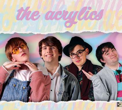
My front digipak panel:

My front digipak panel:
Right-click the image and open it in a new tab for a bigger version.

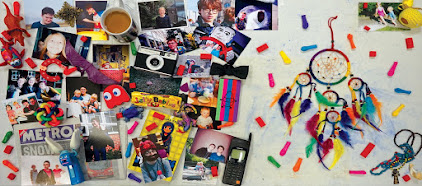
My inside digipak panels:

My inside digipak panels:
Right-click the image and open it in a new tab for a bigger version.

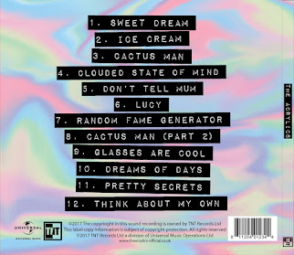
My back digipak panel (with album spine:)

My back digipak panel (with album spine:)
Right-click the image and open it in a new tab for a bigger version.

Click the image below to open my website in a new tab:

Sunday 26 November 2017

R+P Post 23: Planning my web pages

After looking at all the conventions of websites in our genre of indie pop, we moved on to designing our own. We used our knowledge of the general structure of such sites, as well as the smaller yet essential things that also contribute, in order to construct an eye-catching website plan that shows off our band and their aesthetic, helping sell them to the audience, while still adhering to convention. One key convention that really guided our flat plan is that a lot of websites, of the kind we are looking at and trying to fit in with, present everything on one page, with each section available by scrolling and the navigation bar following you down and providing a quick way to jump to each section.
Our final website flat plan, that consolidates all our individual ideas into one, as well as showing off the conventions that we all included in our individual flat plans. Click to enlarge.
We have a header image of the band, to instantly show viewers who we are, and hopefully give an idea of our aesthetic and music if the promotional shots we take are good. A navigation bar setting out everything a visitor could need in a clear way is present above, and it will follow when the page is scrolled down, providing a constant opportunity for interaction through the social media links and thus encouraging people to get immersed in the site and thus the band. This will make them more likely to like us, and thus more likely to buy our music and/or merchandise. To this ends, buttons that link to our music on iTunes, Spotify etc., to our store, or even to our tour tickets are frequent and obvious, providing ways to interact in and of themselves, while remaining ways to buy. We may also have a pop-up that appears when you first enter the site, informing people of our new album and music video, and how they can buy it. The video itself is also near the top of the page so that people can interact by clicking it, and then experience a three minute long showcase of our band's music, personalities, aesthetic and more to draw the audience in. The entire website will have a colour scheme and general aesthetic that matches our band and their video, and this synergy continues into the social media pages, which are also ways to advertise things like band merchandise and music.

We each did a flatplan before the final version. We each focused on different aspects despite sharing certain key conventions, such as the navigation bar, and these aspects guided the final version. Noa really focused on the infinite scroll, being particularly inspired by the website of Alvvays. We decided it was a good idea because it was conventional, but also because it provides everything the audience could want on one page, including information on the band as well as ways to buy. However, multiple audience members told us they thought the main column of the website was too small, with the art on either side taking up too much space, and so we changed this in the final version by widening the main column and fitting more in.
Noa's flatplan. As you can see, she has left a long thin space for the majority of the website, while still adhering to the conventions of having a navigation bar and set of images at the top, as well as an obvious 'buy' button. Click to enlarge.
Part of the infinitely scrolling blog of Alvvays' website. You can see the clear influence on Noa, with a fairly thin strip for infinitely scrolling information surrounded by a pleasing design that matches the band's aesthetic. Click to enlarge.
I focused on delivering as much information as possible as quickly as possible, to capture the attention of audience members who visit the website. I noticed this was conventional, with large headers on websites like that of Echosmith, that show off a music video or set of images or both. We ended up including a fairly dense block on information at the top of the website on our final flatplan- the audience wanted a title at the very top too, though, to introduce the website before this block of information. Thus this was added to the final design.
Part of my flatplan. This segment shows my idea for a navigation bar with a lot of different options, including all the standard opportunities to buy such as 'tour' and 'shop,' and extra ways to interact and get acquainted with the band like 'win' and 'about' respectively. The 'win' section is conventional, but slightly less common than, say, the 'music' button, but it made it from my flatplan onto the final version.
The top of Echosmith's website, which provides a lot of information at once, and which was one of my favourite inspirations. The header image is also the thumbnail for the band's most recent music video, and the navigation bar is clear and easy to read, with the band name as well as all the relevant buttons. The colour scheme is instantly clear. Click to enlarge.
Jack liked the idea of having a set of images that people could click through as the header of the website. This provided a way for the audience to get a quick idea of what our band is like, while also allowing for some interactivity. He then placed the music video under this, so that people who have been drawn in enough at this point can scroll down and see a whole new section of the site with a video for them to watch, rather than wasting our 'ace in the hole' right away. This idea made it into the final flatplan, and Jack was inspired by Sheppard's website.
The relevant section of Jack's flatplan, showing the image box and arrow keys to go through all the images, and then the video right underneath rather than being part of it. Click to enlarge.
Sheppard's website. The navigation bar is at the top, and then their is a long picture showing a promotional picture of the band and then some tour information as you scroll down. Then when you finish scrolling through the image, you reach a set of two videos to further interact with. Click to enlarge.

No comments:

Post a Comment