We decided to finalise both the costumes and props we would need for the video, since we had already figured out and consolidated our ideas for the band's fashion, style, and aesthetic, as well as all the different set-ups and shots we would need, which already necessitated figuring out all of the props and costume changes to some degree. We first simply wrote out everything on paper to get our ideas down, and then we worked from there.
 |
| The first page of our preliminary costumes sheet. We figured out most of the basics for each person's costumes- everyone has a 'performance' costume they wear for the band shots, and a 'narrative' costume they wear when they are acting the part of a character from a classic piece of media. Additionally, Casey has an extra costume for the narrative sections we added later- pyjamas for the shots in her home before and after she has the dream. Click to enlarge. |
 |
| The second page of the preliminary costumes list. We wanted all the band members to look fairly similar in terms of performance costume- that's why they are all wearing different coloured shirts on this ideas sheet. We later expanded on this idea by having everyone wear a shirt (or in Casey's case a jacket) of a similar colour to the primary colour of their narrative costume, but more pastel to fit with the band's aesthetic. Click to enlarge. |
The narrative costumes were fairly simple, as we simply had to replicate the costumes of the chosen characters- Alice from "Alice in Wonderland" for Casey, Gene Kelly from "Singing in the Rain" for Hugh, Scorpion from "Mortal Kombat" for Guy, and one of the Beatles from the cover of their album "Sgt. Pepper's Lonely Hearts Club Band" for Terence. We also decided to give Casey some make-up so she would match Alice better, and then give the rest of the band members the standard make-up to make them look good under studio lights, and no more. This had the added benefit of making Casey stand out more, as she should as the face and major personality of the band.
 |
| The visual reference for Casey's Alice costume. We used older versions of the characters in keeping with the song's themes and the video's storyline- this we went with the older but very recognisable 2D animated "Alice in Wonderland" film, rather than more recent adaptations in live-action and similar. We imitated both the costume and the make-up, such as the pink lipstick and eye make-up. Click to enlarge. |
 |
| The visual reference for Hugh's Singing in the Rain costume. It is a screenshot showing Gene Kelly in the most famous moment of the film, where he is dancing and of course singing in the rain. We simply had to get a nice suit costume together, as well as a similar-looking hat, and we noted down the umbrella for the props list later on. Click to enlarge. |
 |
| The visual reference for Guy's Scorpion costume. As with Alice, we went for the classic, recognisable version of the character's costume from the older games to fit with our ideas. This also made it easier for us when it came to creating the costume, as newer versions of this character from the newer "Mortal Kombat" games have much more elaborate costumes. Plus, the older version has a stronger yellow, which we decided would look good in the video. Click to enlarge. |
 |
| The visual reference for Terence's Sgt. Pepper costume. Out of all four colours, we chose red, as we already have bright blue and bright yellow narrative costumes, and we thought red clothing needed to build the costume would both be easier to find and look nicer alongside the other costume colours in the final video than pink clothing. Click to enlarge. |
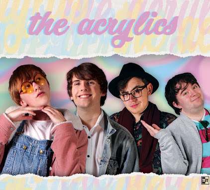
We then moved on to the performance costumes. We looked back at our influential artists for ideas on what kind of clothes we should be wearing- we already knew the colours, as the colour scheme came from our band and video aesthetics. This culminated in the three male band members wearing black jeans, with a pastel coloured shirt that somewhat corresponds with the colour of their narrative costume, and Casey herself in a blue denim jacket and blue top to match her Alice costume, also with black jeans. In this way we have created synergy with the band's overall aesthetic, such as the clothes they will be wearing on promo shots on the website and such, but we have preserved the video's unique aesthetic too. Someone from our target audience said "the costumes make the band look like they belong together," so we seem to have been successful.
 |
| A picture of Lucy Spraggan. Artists like Lucy Spraggan, as mentioned previously on this blog, have been very inspirational for us when developing costumes for our band. We looked through all our old reference photos as well as some new ones in order to find the best fashion choices for our music video costumes, and this photo of Lucy Spraggan was particularly useful for Casey's performance outfit. Click to enlarge. |
 |
| A picture of Echosmith. They have been a big influence throughout, and at this stage it was no different- we liked their different shirts and varying accessories, and although we were looking primarily at fashion and clothing styles rather than colours, the colour scheme in this photo (as well as others) did have some influence on our music video costumes. Click to enlarge. |
 |
| A picture of New Young Pony Club. We investigated different bands wearing matching costumes, and found it fairly frequent both inside and out of the studio, and both inside and outside music videos. This is a particularly extreme example in that they are all wearing the same t-shirt, but it was helpful in illustrating the extent of this convention, which we used in our band costumes. Click to enlarge. |
Eventually, after various preliminary ideas sheets and research into different costumes, we decided to try and get all the costumes together. We got as many possible options for each outfit as possible, and then tried them out- once we were happy with them, we took photos and used them to create a list of all our costumes. The narrative costumes were a little trickier, as we had to actually create some of them (but we did that as part of this process too,) and we ended up using some of the budget on an "Alice in Wonderland" costume (the exact Amazon listing for this can be found here.) Once they were completed, we took more photos and added them to the rest.
A list of all of our costumes, as well as the people who ended up wearing them, once we finalised the casting.
We also refined our make-up ideas somewhat at this stage, to better fit with the eventual final costume designs. The two people with the most costume-specific make-up were Casey as Alice and Hugh in the band. We tried to replicate Alice's make-up as best as we could, to add an extra layer of authenticity. With Hugh, we wanted to explore his personality and stage prescense a bit more, as he is arguably the next most important member of the band after Casey, and he shares a lot of screentime with her because of their brother-sister relationship. We therefore decided to give him some 'guyliner,' and this eyeliner really helped to make him look more outgoing and interesting, as if he had dressed up and done his make-up to look good in the video alongside his sister. A male band member wearing eyeliner also breaks traditional gender norms somewhat too, which feeds into the band's welcoming nature that they use to appeal to their young target audience.
 |
| We looked once more to our reference pictures of older depictions of Alice. While make-up differed, we noticed a few common traits, and we picked and chose some of the less common but interesting traits we also wanted. We ended up going with the recognisable pink lipstick, as well as eyeshadow (which we added glitter to so it would stand out more,) along with fuller eyelashes. Click to enlarge. |
 |
| A picture of Brandon Flowers from the Killers. We looked to various male icons in the past and tried to find some kind of make-up that set any of them apart, in order to influence Hugh's make-up. While the Killers are closer to indie rock than our chosen indie pop, they are still very similar to our other influences and our band in a lot of ways, and besides that Brandon was one of the first big stars to break the norms of male fashion by wearing make-up. Click to enlarge. |
The only other costume considerations we had to work on was the range of costumes for the party scene at the video's climax. To take some of the pressure off of us at this busy time so we could focus on other parts of the project, and to add to our video's authentic and DIY aesthetic, we asked all the people we had cast for the party scene to suggest their own costumes for this scene based on what they had access to. We gave them some guidelines and vetted their suggestions, and ended up with a wide range of costumes- ranging from other recognisable characters from pieces of media, such as Luigi from "Super Mario Bros." and Shaggy from "Scooby Doo," to costumes that were simply visually interesting, such as a human-sized fried egg.
 |
| The people we ended up casting as extras in our party scene in their costumes. As you can see, their is a fairly large variety of costumes, and we tried to show each costume/character's personality while filming the video- for example, the ghost chased Shaggy, while Luigi did some jumping. Click to enlarge. |
Alongside costume, we worked on our props list. Like with costume, we had some ideas on what we would need for each set-up and shot thanks to our storyboard and such, so we decided to make a props list to consolidate our ideas. Like other paper plans of this nature, it helped us finalise our ideas by pulling together and organising all of them in one place for the first time.
 |
| The first page of the props list. As you can see, we divided the props up in a similar way to the storyboard (which we were using to help us create this list) in order to aid organisation. We also noted which props we would have to create to further help organise us, as this ended up being quite a few props because of our DIY and cardboard-style video aesthetic. Click to enlarge. |
 |
| The second page of the props list. This page also contains all of the musical instruments we needed- it was during the process of creating this list that we finally decided exactly what each band member was playing, as previously Guy and Terence could have swapped instruments (either with each other or to a different instrument completely) anytime before the video. While this was incredibly unlikely, especially as we had built their personalities while knowing what instrument they played, finalising this decision based on props we knew we had access to was quite good for organisation. Click to enlarge. |
The next step was gathering all the necessary props. Most of the props we provided ourselves, either as we owned them or knew people who had them and would be willing to lend them to us. We also got a few props through school, such as the Drum Kit, and we purchased the TV simulator with some of the budget as we knew it would provide a great effect but no-one we knew had one (the exact Amazon listing for it can be found here.) That left the props we had to make, so we created a few preliminary designs for these props, gathered the necessary materials, and met outside of school a few times in order to make them.
 |
| An example of a preliminary props design sheet. This page shows some of the Mortal Kombat set-up's props, such as what would eventually become the "Fight!" sign, as well as the health bars that we would hold up above the actors. Click to enlarge. |
 |
| The final evolution of the "POW" sign on the design page above. When creating it, we weighed up the practicality of our plans and adjusted them accordingly. Thus, instead of string, we will just have someone hold the sign, and of course the text itself has been edited too. Click to enlarge. |
 |
| The final versions of the health bars. They also changed slightly from the design sheet, with the names hanging down with string instead of being on top of the bar- this was easier to make, made both the bar and names clearer, and is more accurate to the actual video games we are referencing in which the names often sit below the bar. We provided the cardboard, sticks, and string, and used the school's paint. Click to enlarge. |


No comments:
Post a Comment