


 |
| The front and back panels of our flatplan. We have included genre conventions such as the border, as well as important but more general conventions such as having the band's name on the front and the song names on the back. We gave it a bit of unique flair to represent our band's personalities by having a line-up of the band (conventional for debut albums as people seeing the album and thus band for the first time must be able to gain some information about them,) but making the sizes of the people in the line-up go down in descending order, but not to too small a size, as the smallest person must still be visible on a CD-size case. |
 |
| The front of Echosmith's album "Talking Dreams." We really liked this one- it has the conventional border, the band and album names large and obvious, and a very clear colour scheme to introduce the band. We sketched our flatplan and thus it is in black and white, but we specifically annotated that we were going to have a lot of colour, in part due to the influence of this album, as well as due to audience input, in which audience members stated they wanted to see lots of colour that lined up with the band's aesthetic. Click to enlarge. |
 |
| The front and back of New Young Pony Club's "Fantastic Playroom." This is their debut album, and thus as is conventional the band appears on the front. They are very clear and easy to make out, due in part to the plain background, but this doesn't impact the overall design on the album- in fact, it compliments it, as it benefits its strong white and red/pink colour scheme that extends from the front onto the back. The text is also clear and easy to read, so you can see the conventional and important information such as the band, album, and song names. Click to enlarge. |
 |
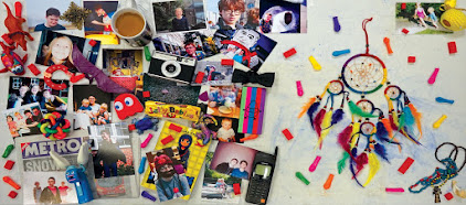
| The inside panels of our album. We drew in the CD's location in order to design around it. We wanted more personality to be available in these sections, to further inform and draw in people who liked the cover enough to open the album. Thus we settled on a picture of a table, to provide a nice background, with a lot of things relevant to our band sitting on top- this includes relevant music equipment such as a guitar pick, microphone, and drumsticks, as well as pictures of the band and its members. We noticed things like this on a fair number of albums we researched, and furthermore, many audience members mentioned to us that they quite liked the idea as they didn't see it as often as plain inside spreads. Click to enlarge. |
 |
| All panels of "California Nights" by Best Coast. This was also a very influential album- it has the border and image of the band on the front, as well as clear and readable text showing the album, band, and song names. Inside, there are a lot of pictures of the band, to further show off their personality and get people invested in them, especially since people who have opened the album to look at the inside are already somewhat interested due to the front of the album. Click to enlarge. |
No comments:
Post a Comment